
Bright Group, LLC—formerly known as Bright Ventures—was the first design job I acquired since graduating from RIT in the Spring of 2024. The team was looking for a single graphic designer to take on the role but the initial scope of the project appeared to be too much for just one designer. That is why my good friend and fellow graphic designer, Lily Stango, asked for my assistance with this project!
With our combined strengths we worked together to create a final product our client could be proud to showcase at their upcoming summit meeting. It was a big task to undertake, but we successfully managed to pull it all off, despite a few hiccups along the way.
The Client
The project began as a brand overhaul for Bright Ventures and it's subsidiaries: The Constellation, Asteri, The Bright Ventures Foundation, and Bright Advisors. Bright Ventures first hired on a different designer to tackle this project, but unfortunately the they had to step aside due to personal reasons and could not complete the project as planned.
Since this project was nearly halfway done by the time it was handed off to us, we were hopeful in getting all of the work done in the 3 month timeline they had. And while we did manage to finish all of our assigned task, it was quite the undertaking on our part.
The Assignment
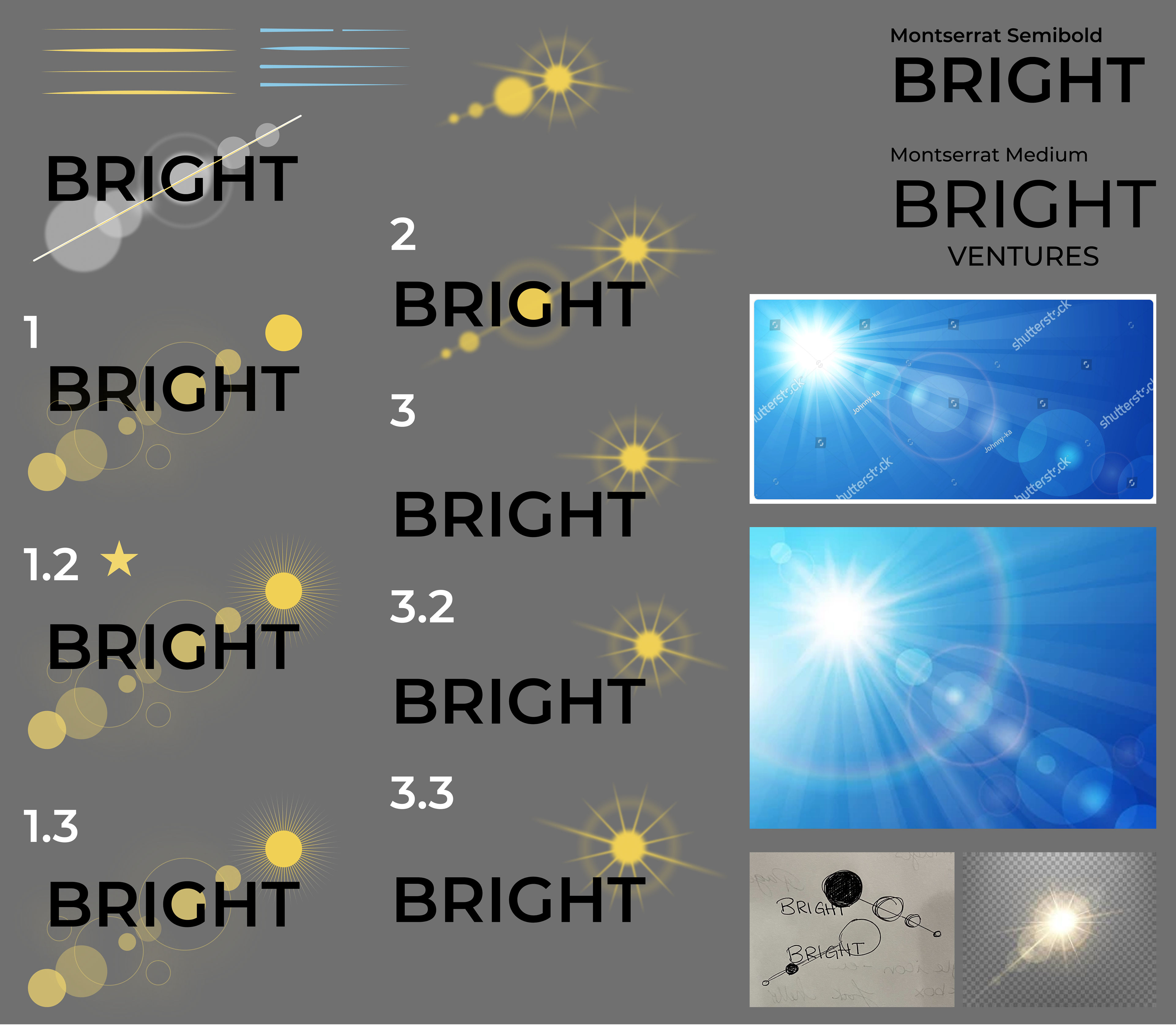
Mood Board created by previous designer for main business Bright Group (top)
and the Bright Ventures Fund (bottom)
Lily and I had the unique experience of designing a new logo and brand guidelines for two entities that must ALSO be cohesive with three other logos created by another designer. We were determined to make all of the designs work well together, which led us to become quite familiar with the previous designer's work.
We were quite thankful that the previous designer had kept very thorough process documentation that we could refer to while working. Whenever we had any specific design questions about the finished logos, we could easily check the process document and have our answers rather quickly.
The Master Brand
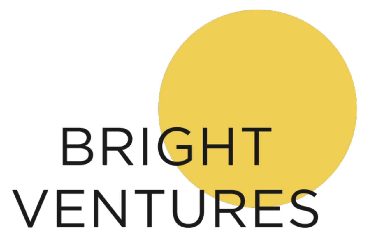
Previous Bright Ventures Logo
The first step when it comes to any of my projects, whether they be design projects for a client or just a simple job around my home, is research! I'm a big proponent of knowing my client and thoroughly understanding what they want their brand to say—literally and metaphorically.
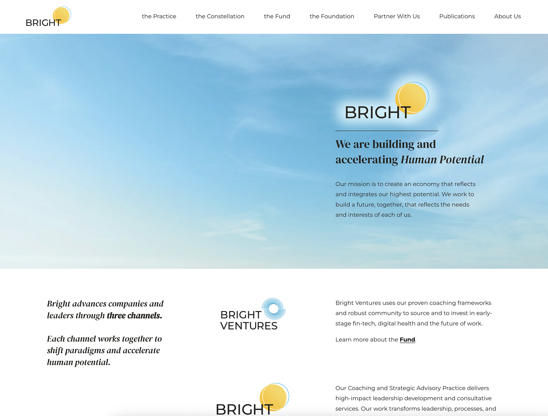
When speaking with Lenore Champagne Beirne, the founder and managing partner of Bright Group, we discussed what they were looking for and why they had decided to pursue a brand overhaul. We learned that the Bright Ventures company was evolving into Bright Group—a name change meant to better convey their transition into more than just a singular venture capital and private equity firm.
The Bright Group, as mentioned previously, is the parent company to several subsidiaries:
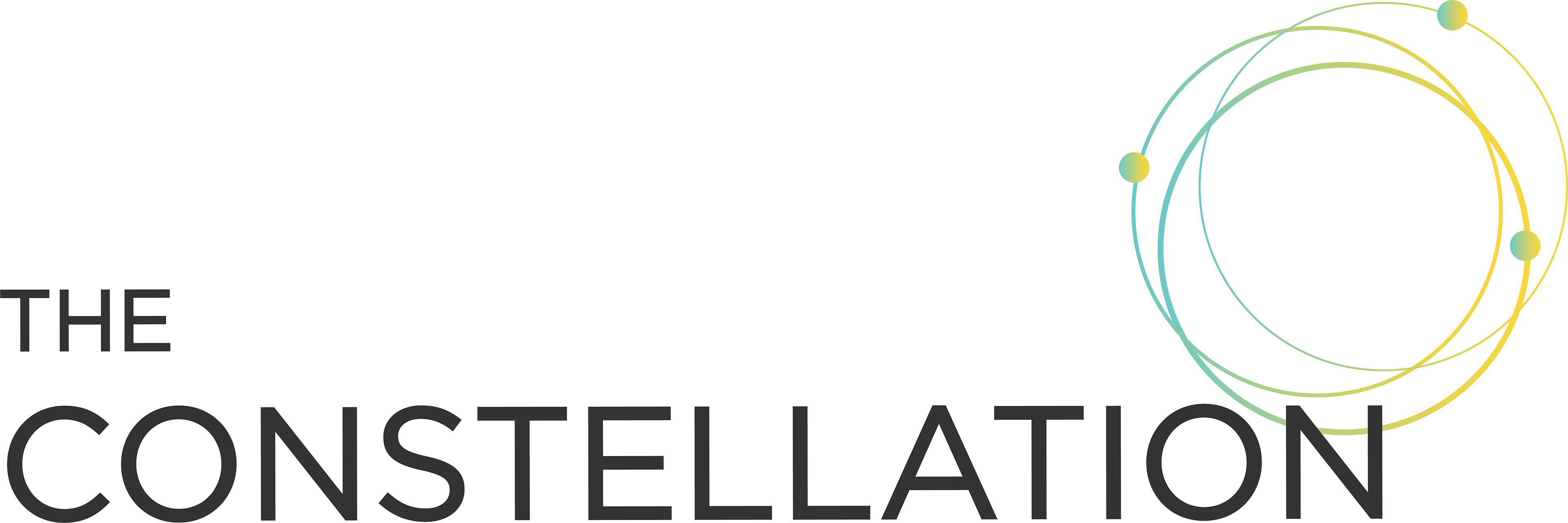
• The Constellation— a community united by a vision of a brighter future by uniting diverse perspectives through programs and events.
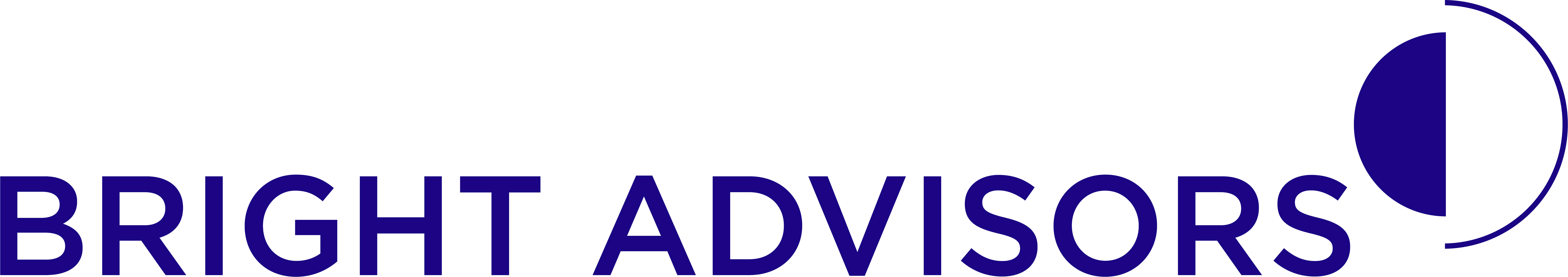
• Bright Advisors— wealth and investment advisors for people who desire a brighter future.
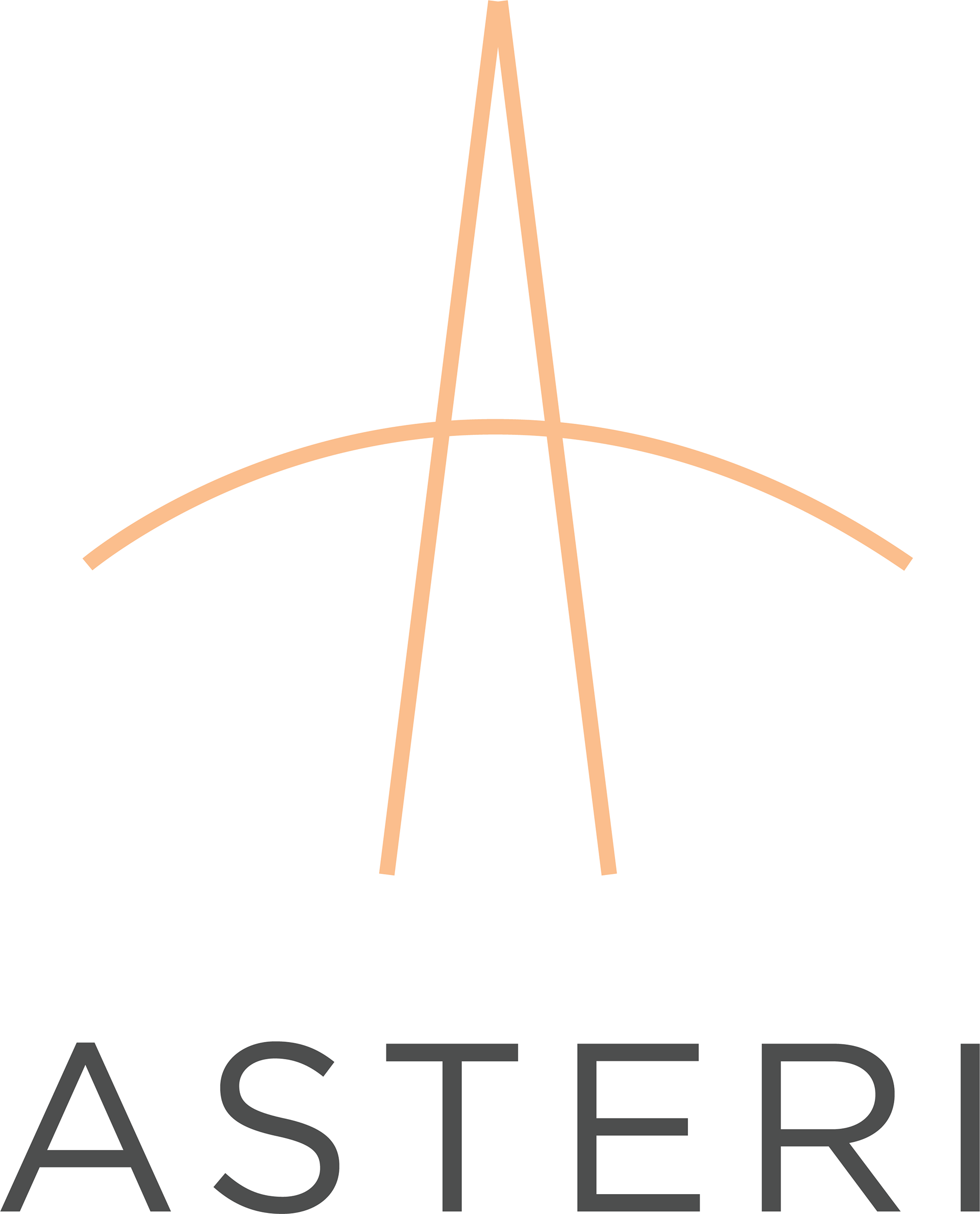
• Asteri— a summit to give women the space to pause, zoom out, and choose the future they want to build and carve out the path it takes to get there.
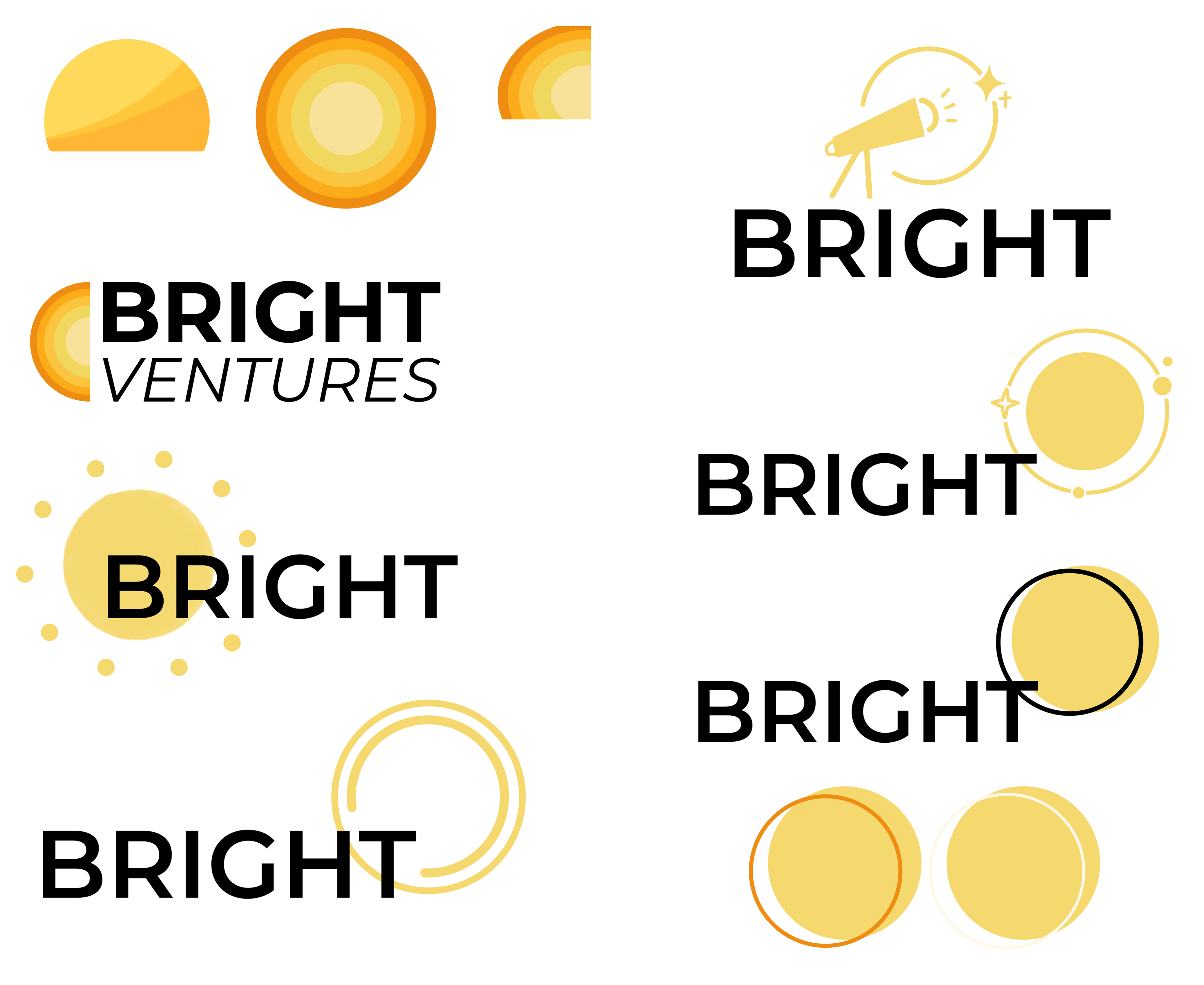
The previous logo, as shown above, features a simple logotype lockup with the words "Bright Ventures" overlayed onto a yellow circle alluding to the sun. While the client enjoyed this design, they wished to "spiffy" it up a bit.
Here are some comments that really stuck out to us:
"We want it to feel hopeful, energy and light, acceleration (something’s about to happen), a sense of power, balance spaciousness with power in the way the brand is delivered. Looking for: depth, dimension, movement, radiance"
Bright started 14 years ago as a coaching services company,
now it has a fund, a community, and the Practice → We’re trying to marry all those things together on the site. This project is to start to separate these vertical channels and give them their own brand identity but under the big master brand of Bright"
now it has a fund, a community, and the Practice → We’re trying to marry all those things together on the site. This project is to start to separate these vertical channels and give them their own brand identity but under the big master brand of Bright"
With such inspiring information, we immediately got to work!
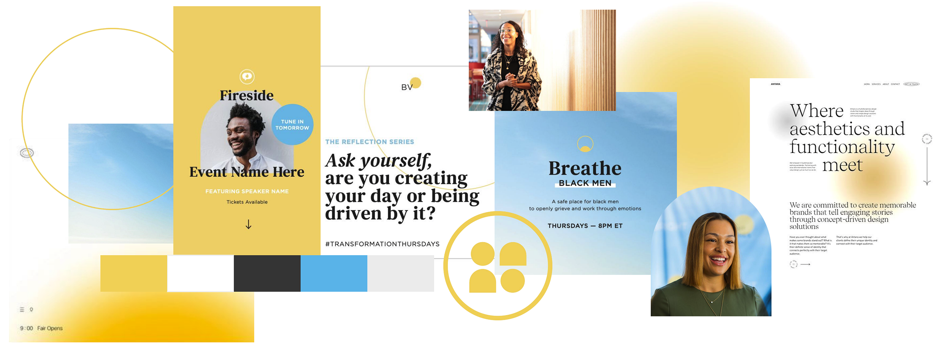
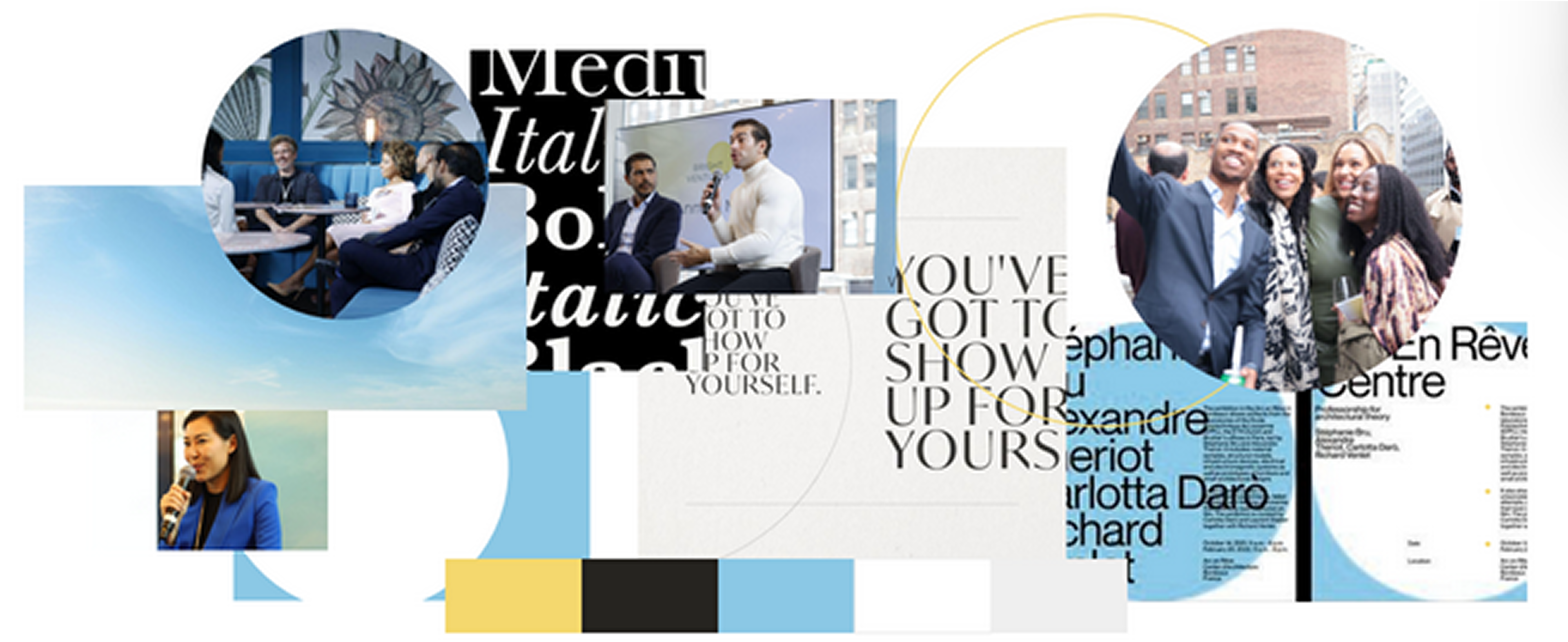
Design Iterations
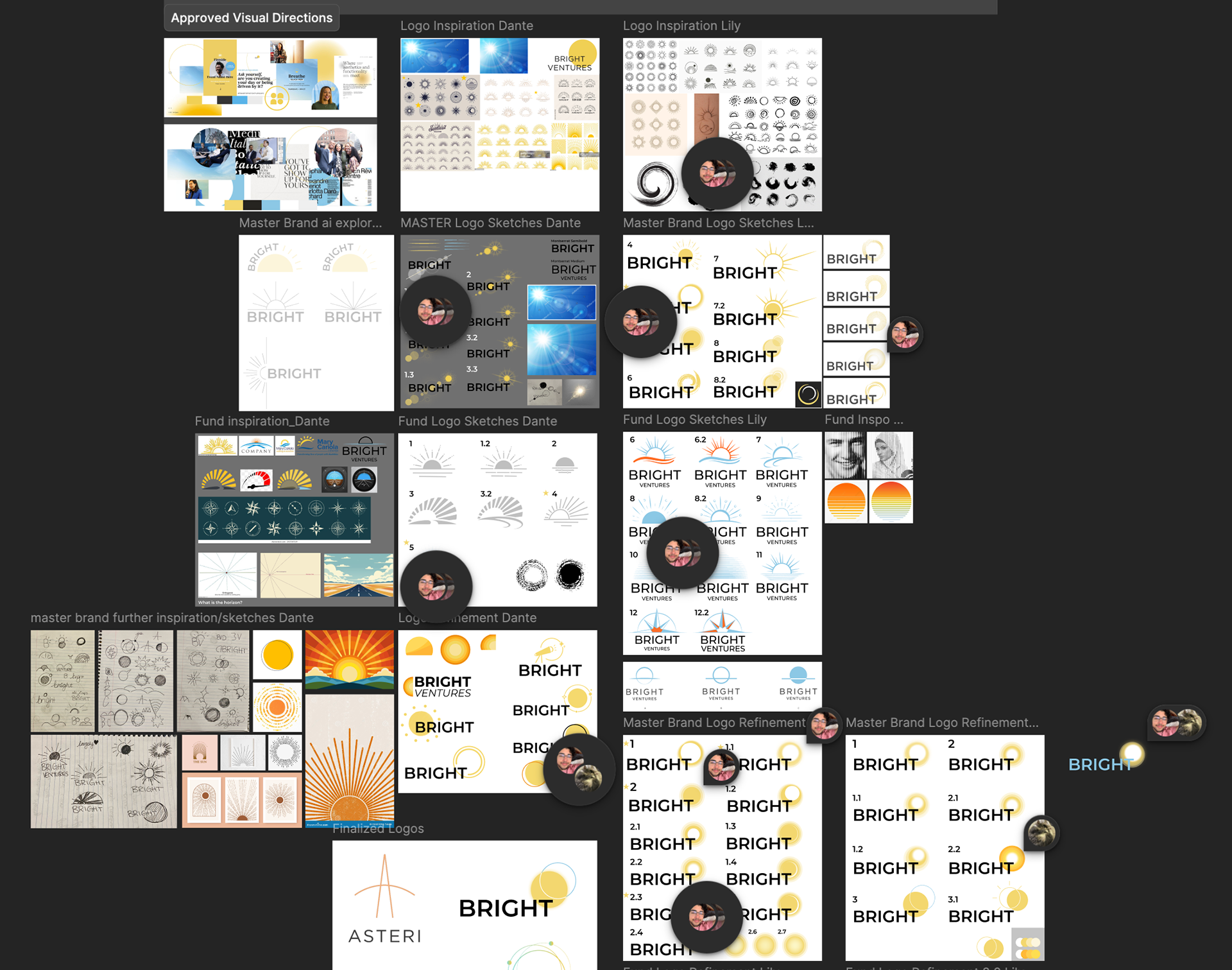
Collaborative Figma Board featuring quite a number
of comments from both me and Lily Stango
Once we were set loose onto the project we ran wild with ideas. Despite us both working on the same assignment at the same time, our approaches were vastly different. My first few concepts revolved around adding some more movement to the logo, while Lily's initial ideas stemmed around adding texture while keeping the simplicity of the old logo.
After several rounds of critiques from the Bright Group, we began to work together to somehow mesh our two ideas into one. Somehow during the process we "flip-flopped" our approaches—I began focusing on adding intrigue through gradients and textures, while Lily spent their time working on the alignment of all of our elements.
Our biggest breakthrough was when we finally settled on our shapes and elements. We kept hearing the words,
"it's so close, the logo is almost there.
There's just something missing."
There's just something missing."
That was when I began playing with the colors and gradients more intentionally.
I wanted to add some intrigue without losing the integrity of the simple design. It only took a bit more tweaking on our end before our client was happy with our work.
I still find it quite funny how simple of a design we landed on. Though it makes quite a bit of sense when looking back on it.
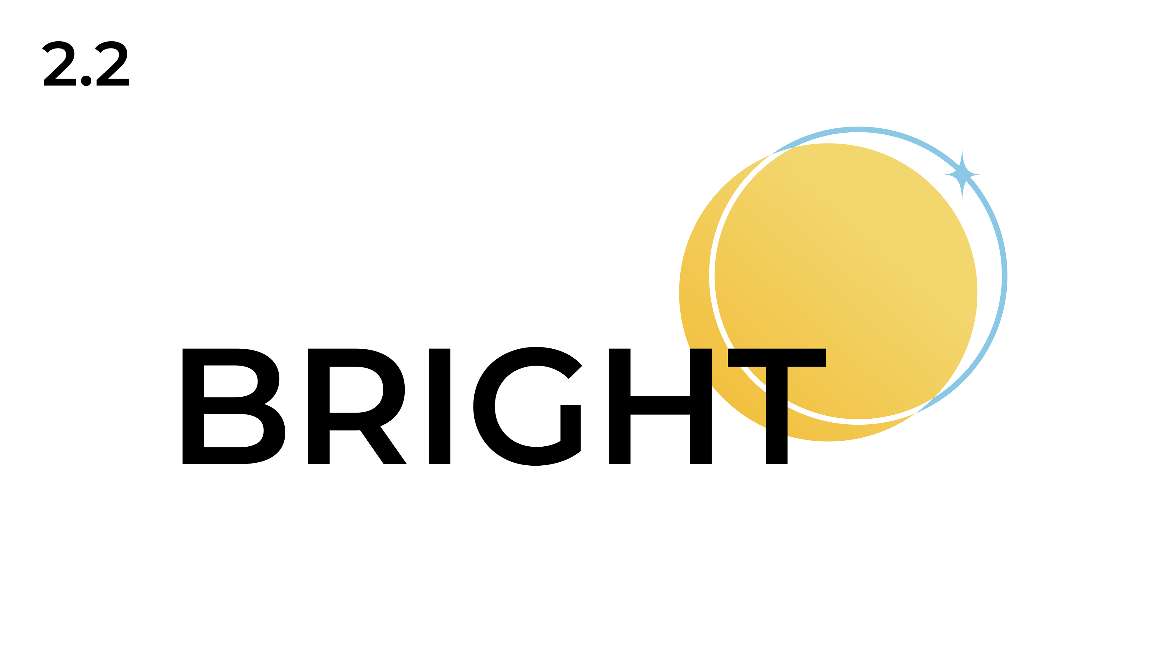
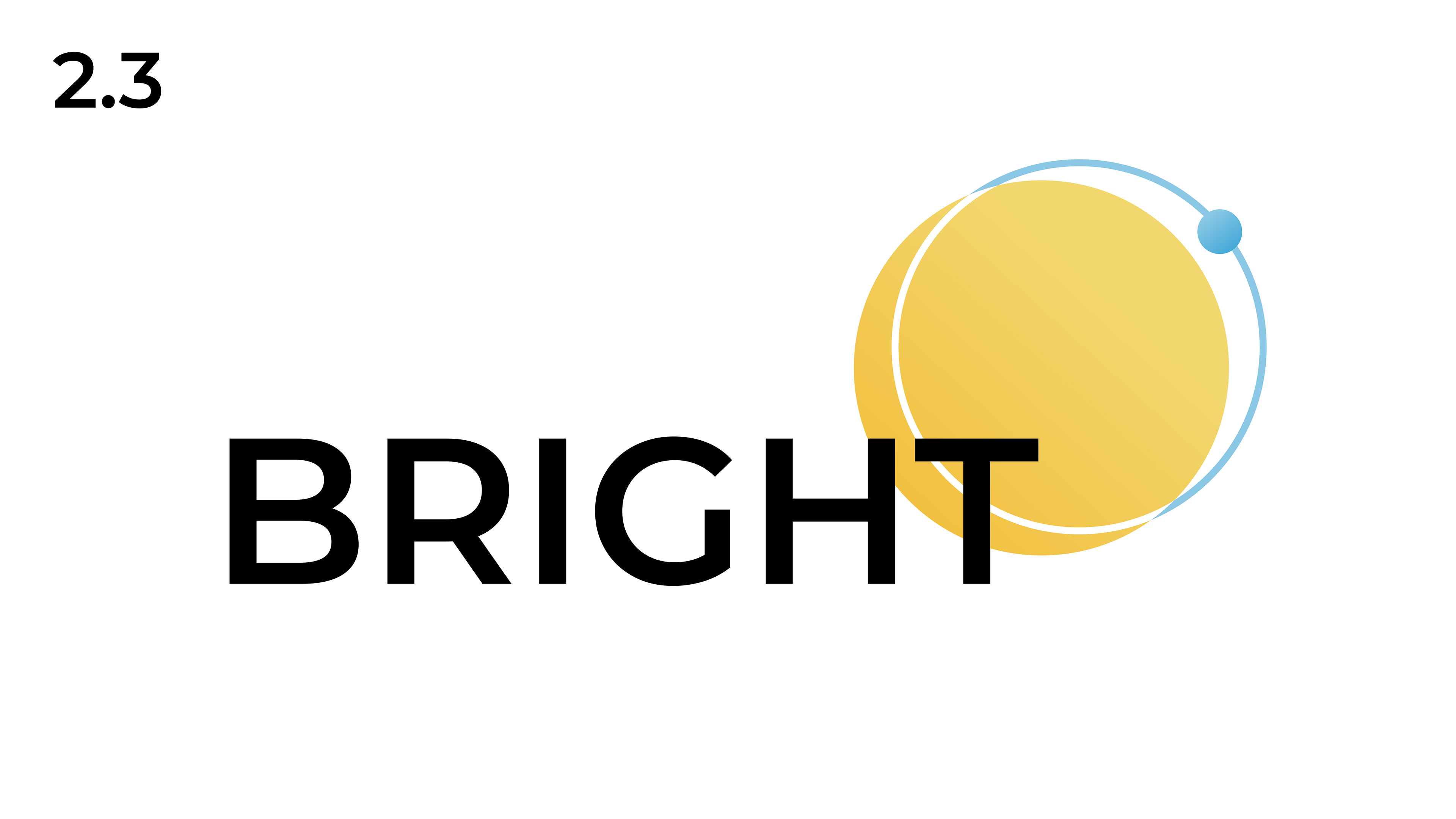
Final Logo
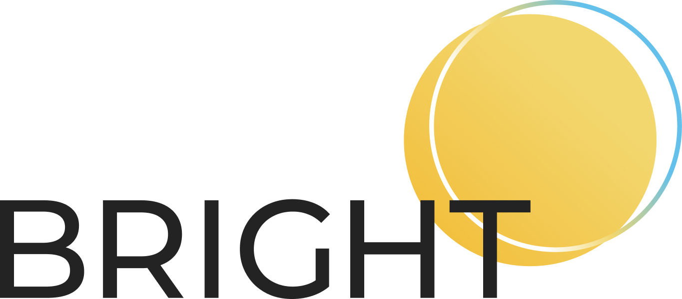
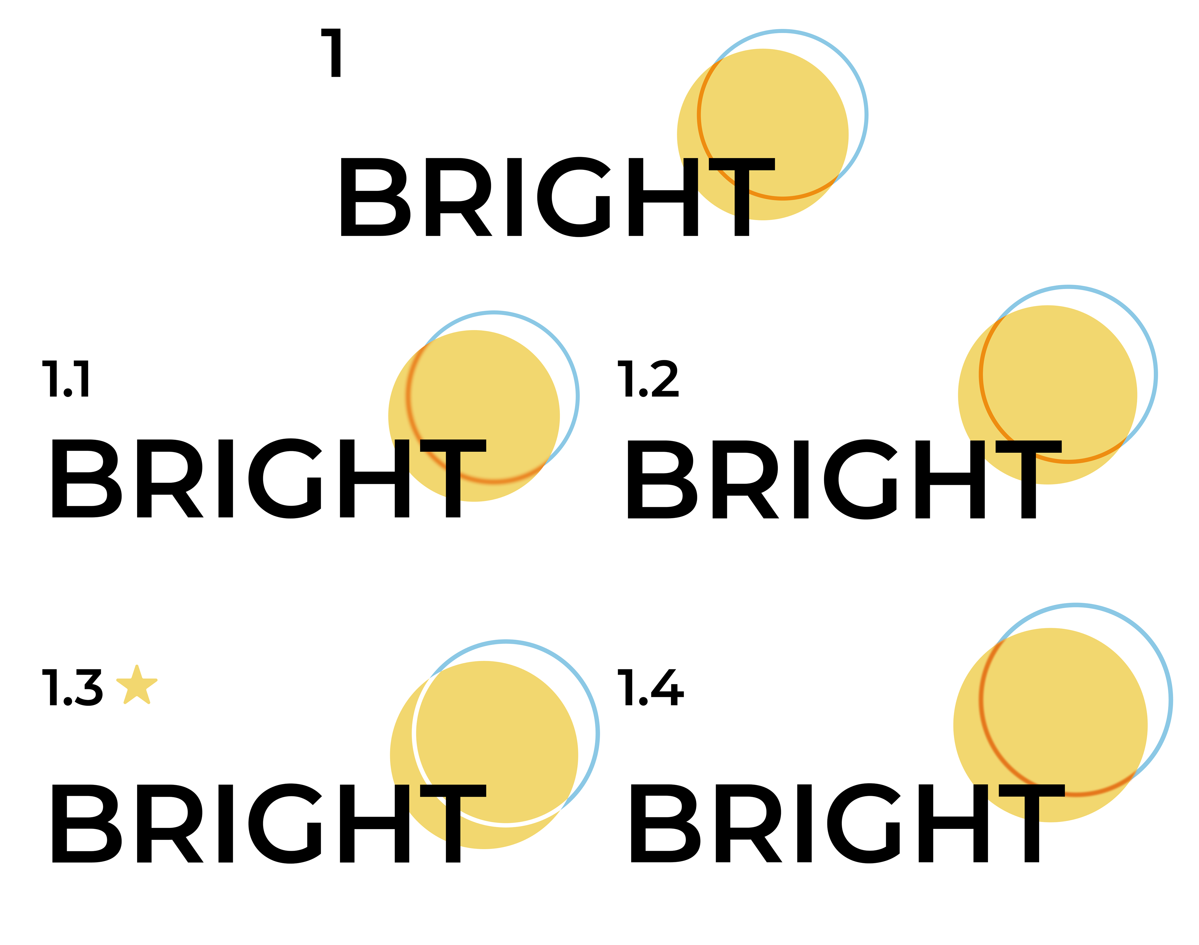
The final logo marries the old with the new.
By this I mean, the logo is still a logotype layered over a yellow circle though this time there is a bit of a gradient on the circle to add more depth. The secondary circle, or ring, is angled up and to the right to signify movement forward into the future.
The ring also includes a gradient but this one transitions from blue to yellow to white, as to incorporate more of the subsidiary brand colors while also adding the "intrigue" I kept mentioning earlier on.
While the logo may feel a bit simple, that is quite intentional. The Bright Group is a venture capital and private equity firm, not a design firm. The logo is meant to exude professionalism while still having a bit of personality to entice investors and future clients.
I found this project to have been a fun challenge to undertake. The consistent feedback and quick response time from the Bright Group was exceptionally helpful and has spoiled me for the future (jk jk).
The Fund
The secondary logo we were working on at the time was for the new Bright Ventures. A bit confusing, I know.
Bright Ventures became the name of the Bright Group's Fund where they "invest in human potential."
The client wished to have a logo or icon that showed momentum and a horizon line. There were a few images that our client shared with us that had a similar element to our final product that we took quite the inspiration from.
Lily Stango, was actually the one that was most involved with the Fund logo design while I personally focused on the master brand design.
To hear more about this design, I highly recommend reaching out to them through their email:
lilystango.design5980@gmail.com
& checking out their own personal portfolio here
lilystango.design5980@gmail.com
& checking out their own personal portfolio here