
OVERVIEW
As a personal project, I designed myself a personal mark and brand identity.
As an up-and-coming graphic designer,
I wanted to establish a personal brand for myself that I could use in my professional career. One that would set me aside from my peers when applying for internships and future design work.
I wanted to establish a personal brand for myself that I could use in my professional career. One that would set me aside from my peers when applying for internships and future design work.
This has been a project I have worked on, intermittently, for several years before I finally buckled down and finalized my design.
When designing my personal mark, I wanted to create something that captured my personality as well as the kind of graphic design work I tend to take inspiration from and create.
Initial concepts
& ideas

My first rendition was from when I was studying as an illustration major at Monroe Community College (MCC).
This early design was one of my earliest involvements with this type of design, as I had no prior knowledge.
The frog depicted is a Coquí, a small tree frog native to Puerto Rico—where I am originally from.
The moniker "frogwater" originated from a nickname I received while attending MCC. My last name used to be "Fraguada", a unique and uncommon last name even back home. My college roommate jokingly mispronounced my name as "frogwater" and the name ended up sticking around.
Although it originated as a joke, I keep the moniker around as a way for me to pay homage to my family as I no longer bear that last name.
Rough Drafts
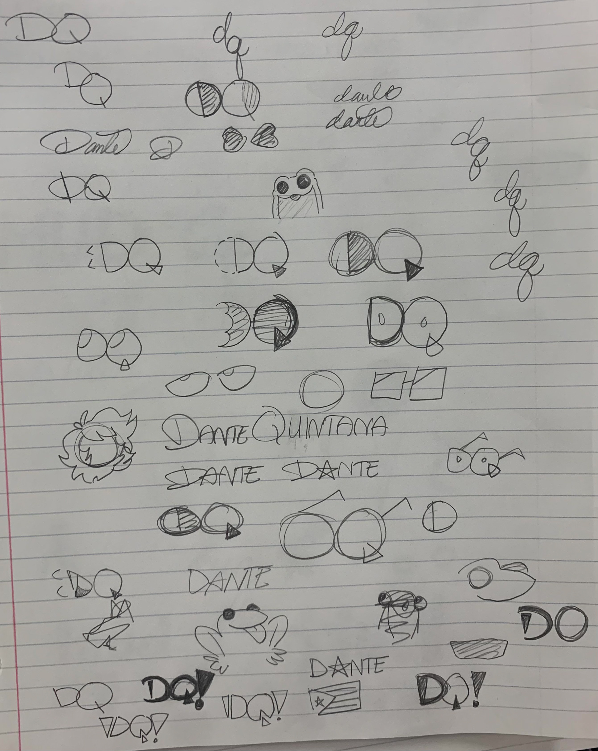

As a more experienced graphic designer, I decided to tackle this project once more—although this time around I actually had the proper education and skills to design a well-fitting personal mark.
My initial sketches feature a lot of different approaches to my initials and full name. The frog motif can be seen making a reappearance, though it doesn't stick around for very long.
I then proceeded to take these sketches to Adobe Illustrator and played around with different shapes and colors.
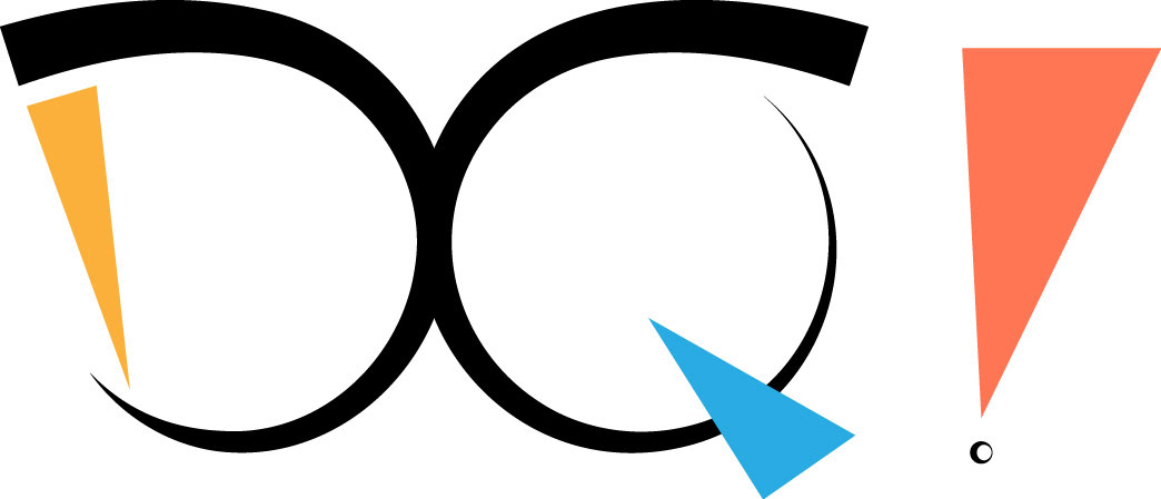
The chosen design concept features sharp angles and bright colors. The first design included an exclamation point as I find myself included that punctuation a LOT when I am hand-writing my notes.
In the end, though, I chose to remove the exclamation point as it didn't quite fit the design I was going for.
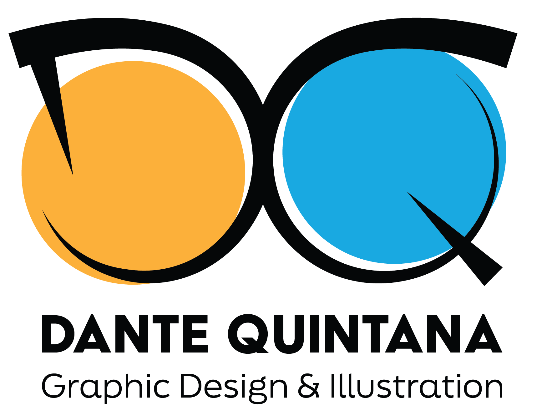
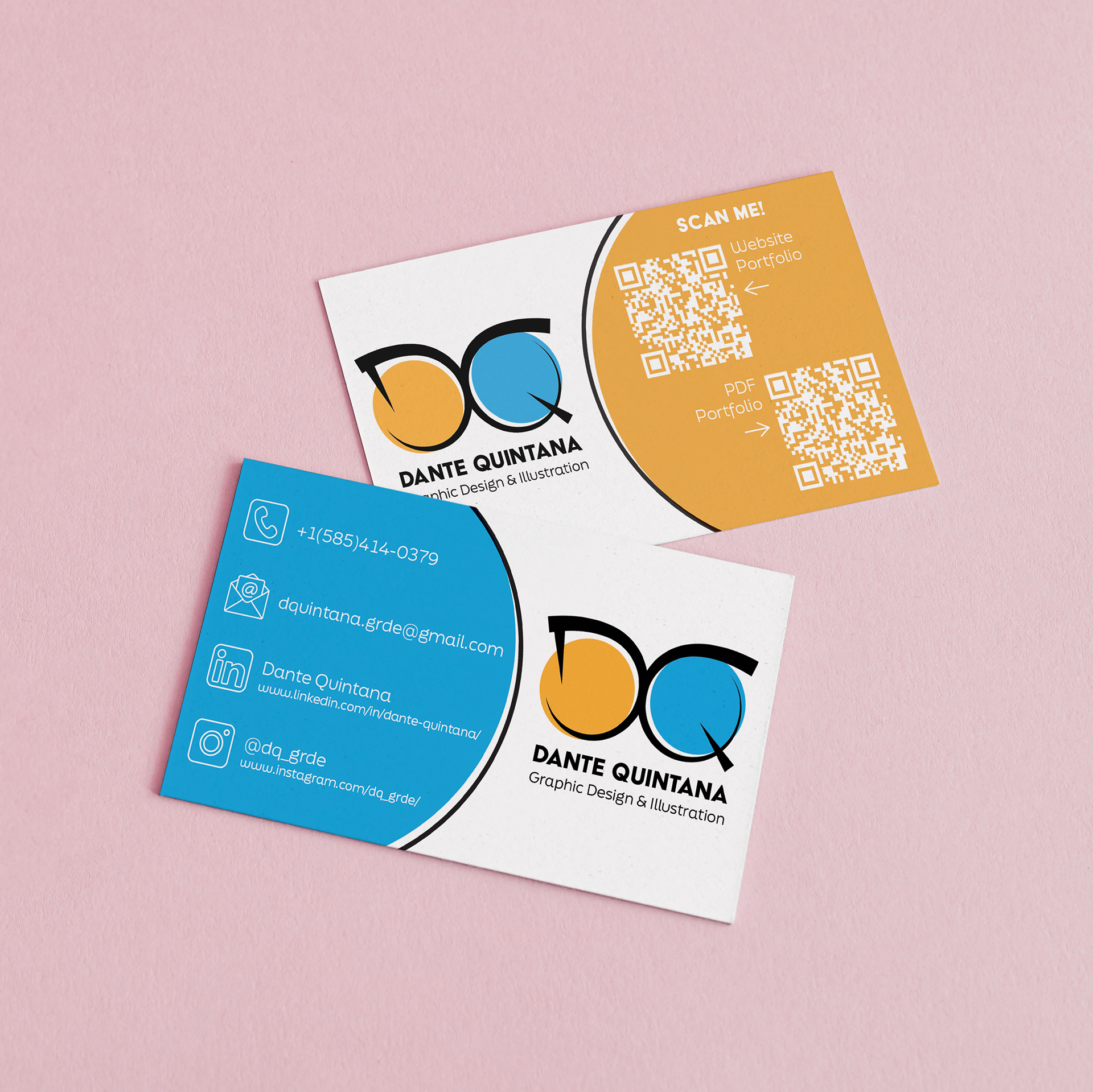
Final design
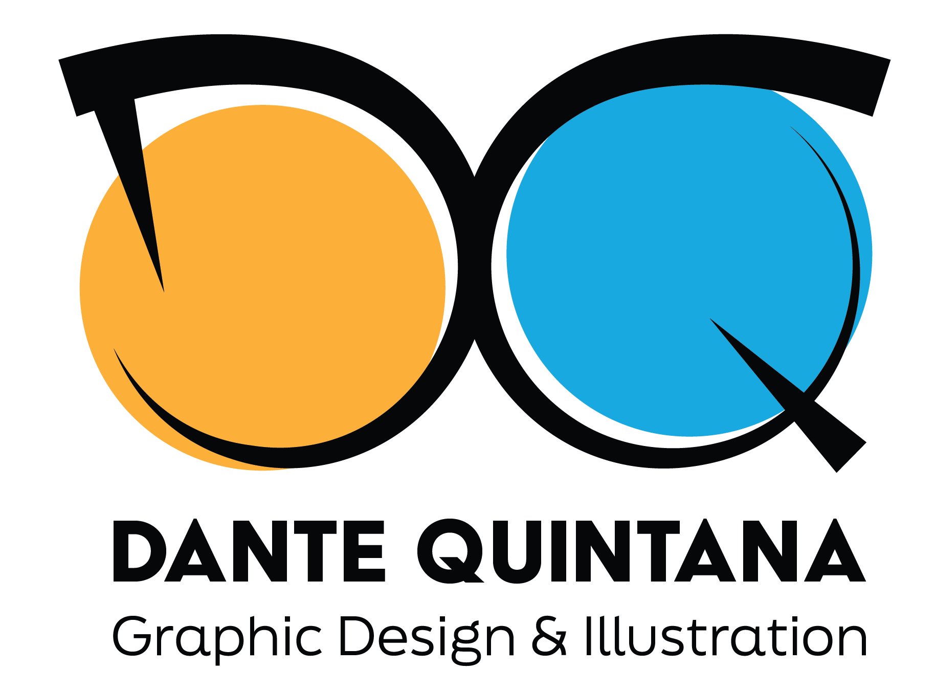
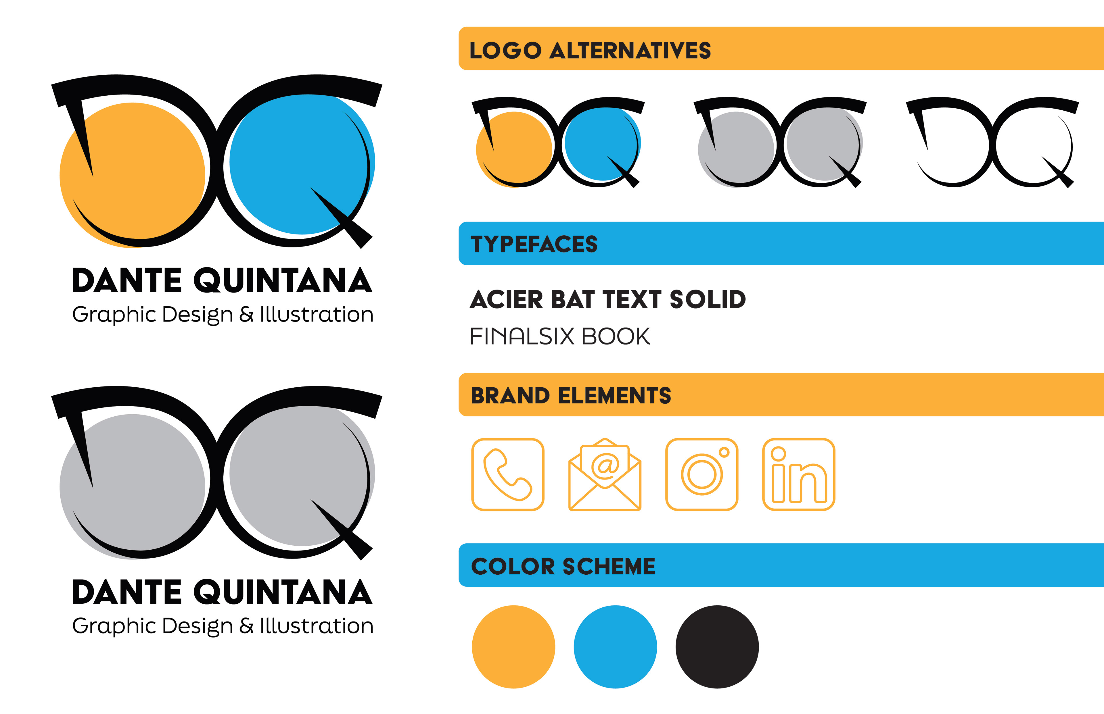
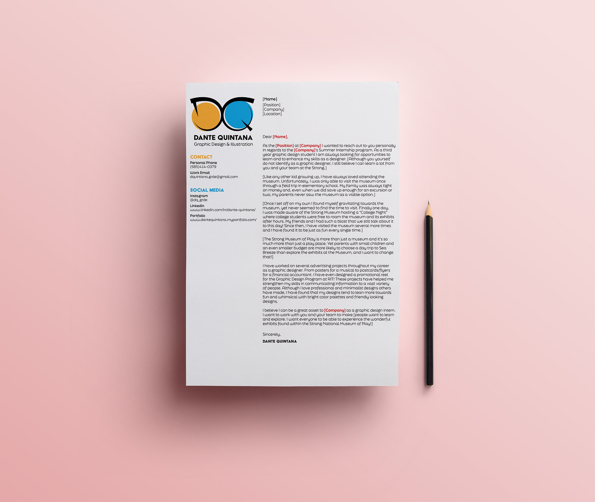

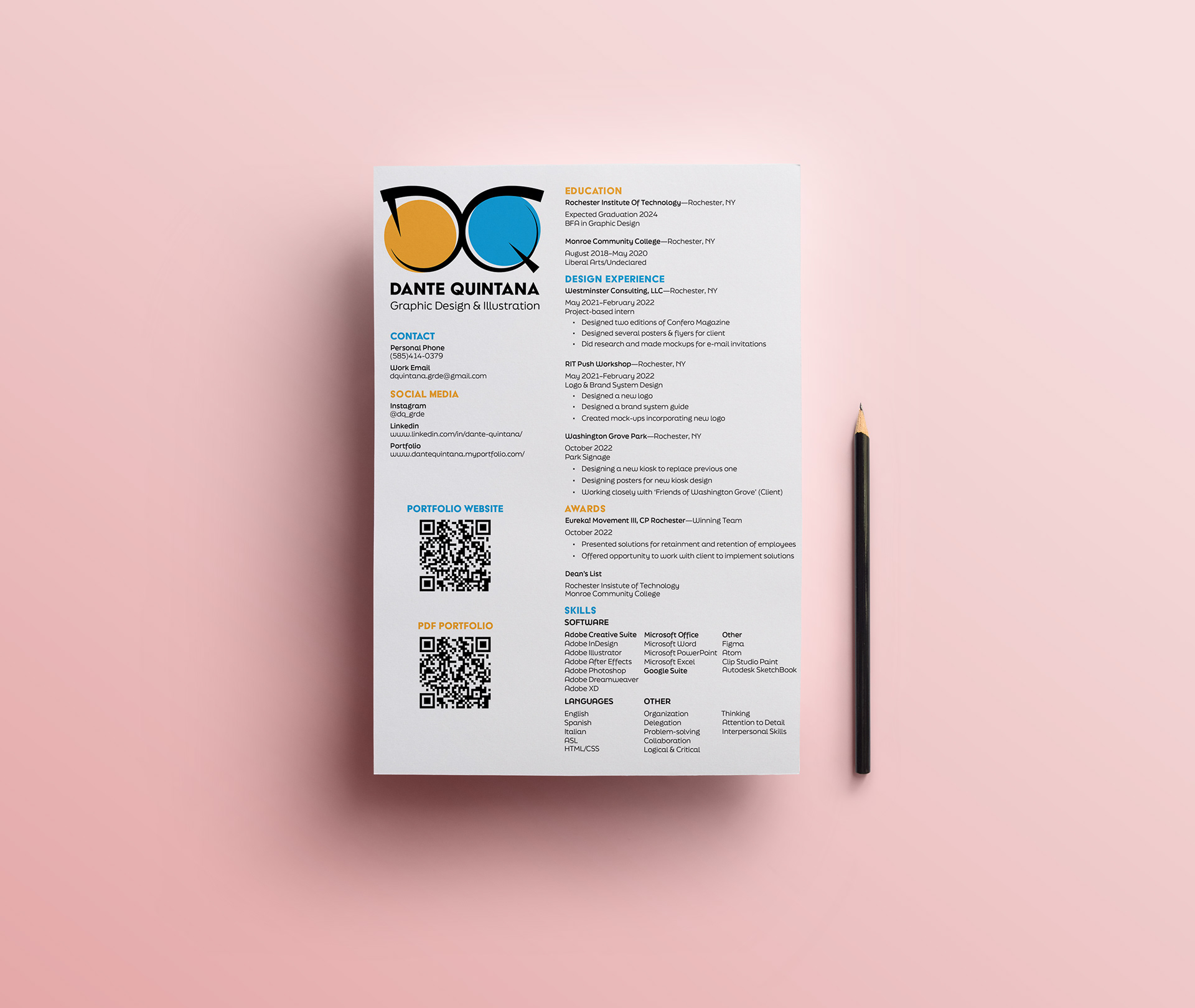
This final rendition of my personal mark is one I feel best captures who I am as a person and as a designer.
The shape of the letters "DQ" are made to resemble the frames of my glasses, along with a tapering stroke that is meant to mimic that of a pencil sketching or designing.
The two circles within the frames of my glasses are meant to be goofy little eyes, that feature my two favorite colors.
The circles are intentionally mismatched and uneven as they are meant to show I am not too strict when it comes to how I design, as well as they add an interesting contrast to the bold letters.
The typefaces used in my brand identity are the ones you have been reading while perusing my portfolio. "Acier Bat Text Solid" is used for Headers and Titles, while "Finalsix" is used for subheads and body text.