OVERVIEW
For this project I set to redesign my hometown's website, the town of Gates!
Before starting this project, I did not know my town even had a website!
I was pretty shocked to find the overall design and user experience was horrendous. I knew I could do a lot better than what they currently had, so I set out to make it as user friendly and easy to navigate as possible.
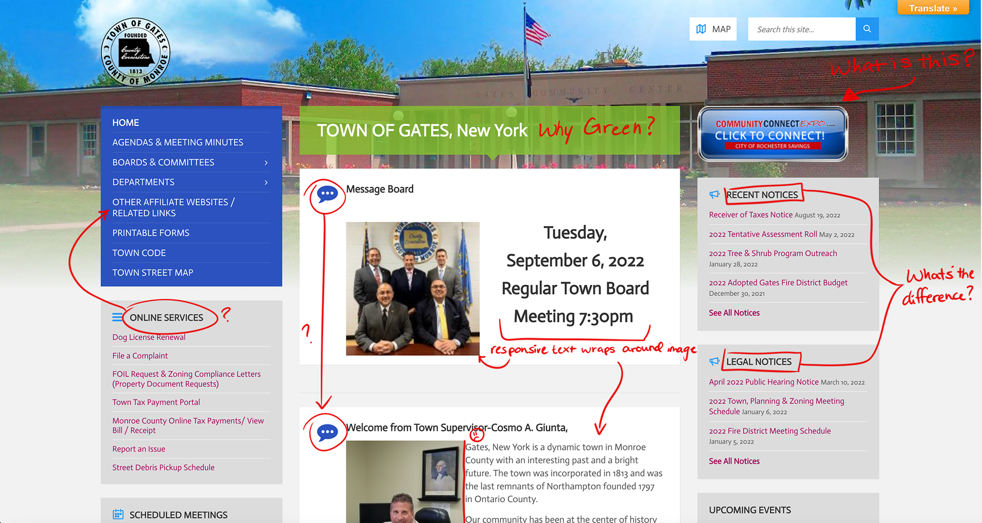
Before getting into the design aspect of this project I decided to navigate the website and figure out what is currently working and what needs some serious work.
In my trip through the website I found a few dead links, as well as unorganized information that was often times hidden unless one knew where to look. This led me to making my main focus be: "how can I make this website more accessible and user friendly?"
Research
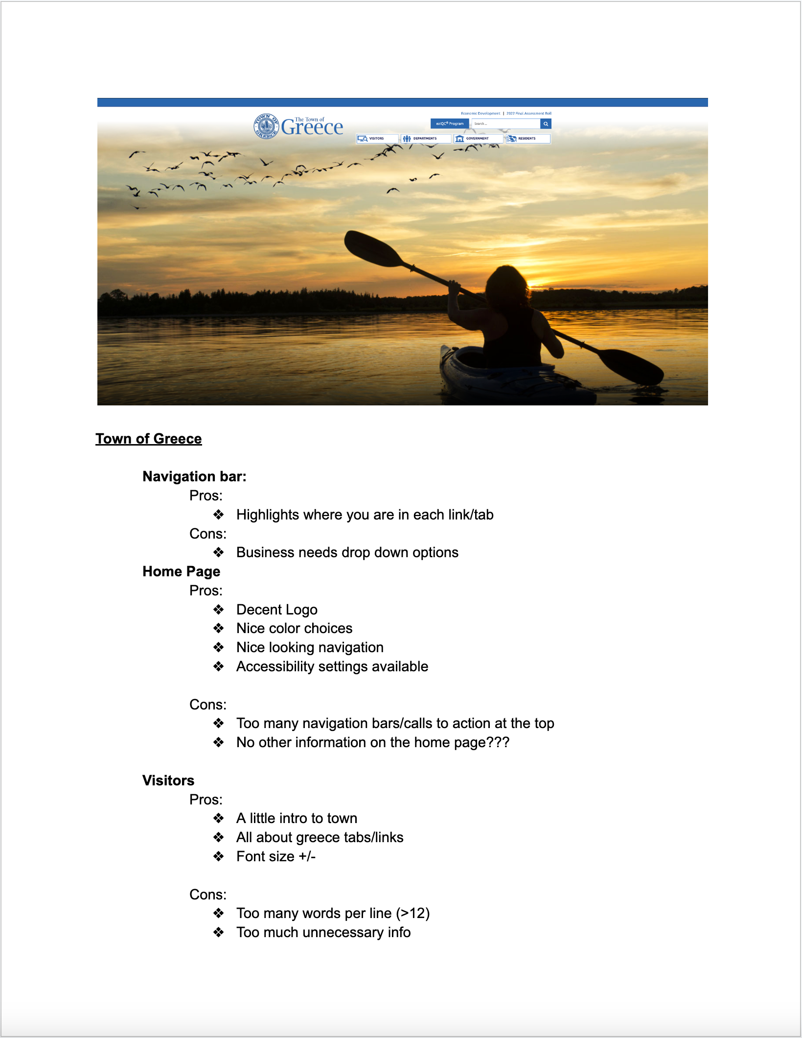
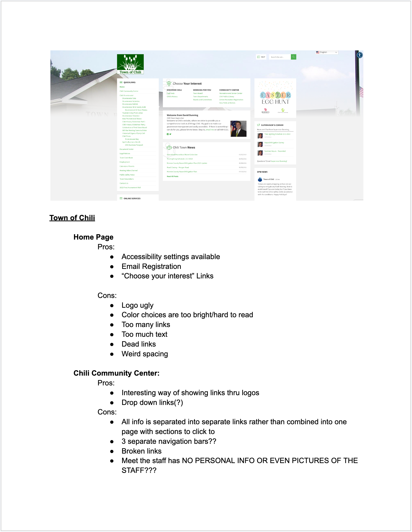
As mentioned earlier, before doing any design work I needed to figure out what the pros and cons of the Gates town website were.
In order to answer this question I created a competitive analysis between the website of the town of Gates and 2 of its neighboring towns, the town of Greece and the town of Chili.
This competitive analysis helped me scope out some ideas that I could incorporate in the new design of the town website, as well as highlighted things that I should try to avoid replicating.
This competitive analysis helped me scope out some ideas that I could incorporate in the new design of the town website, as well as highlighted things that I should try to avoid replicating.
During this research portion of the project, I ended up rediscovering the Gates Chili School District (GCSD) website, which had been redesigned since the last time I had used it.
As I perused the GCSD website I came to the decision to use this website design and layout as the main inspiration for the town website redesign.
I made this decision for two reasons:
1) The GCSD user interface is used for all of the school website designs within the town of Gates, from Elementary to High School.
2) By creating a user interface that is similar to that of the GCSD, I hoped to create a user experience that not only fits the brand/design system already establish but also allows for easier navigation and an overall smoother user experience.
design concepts
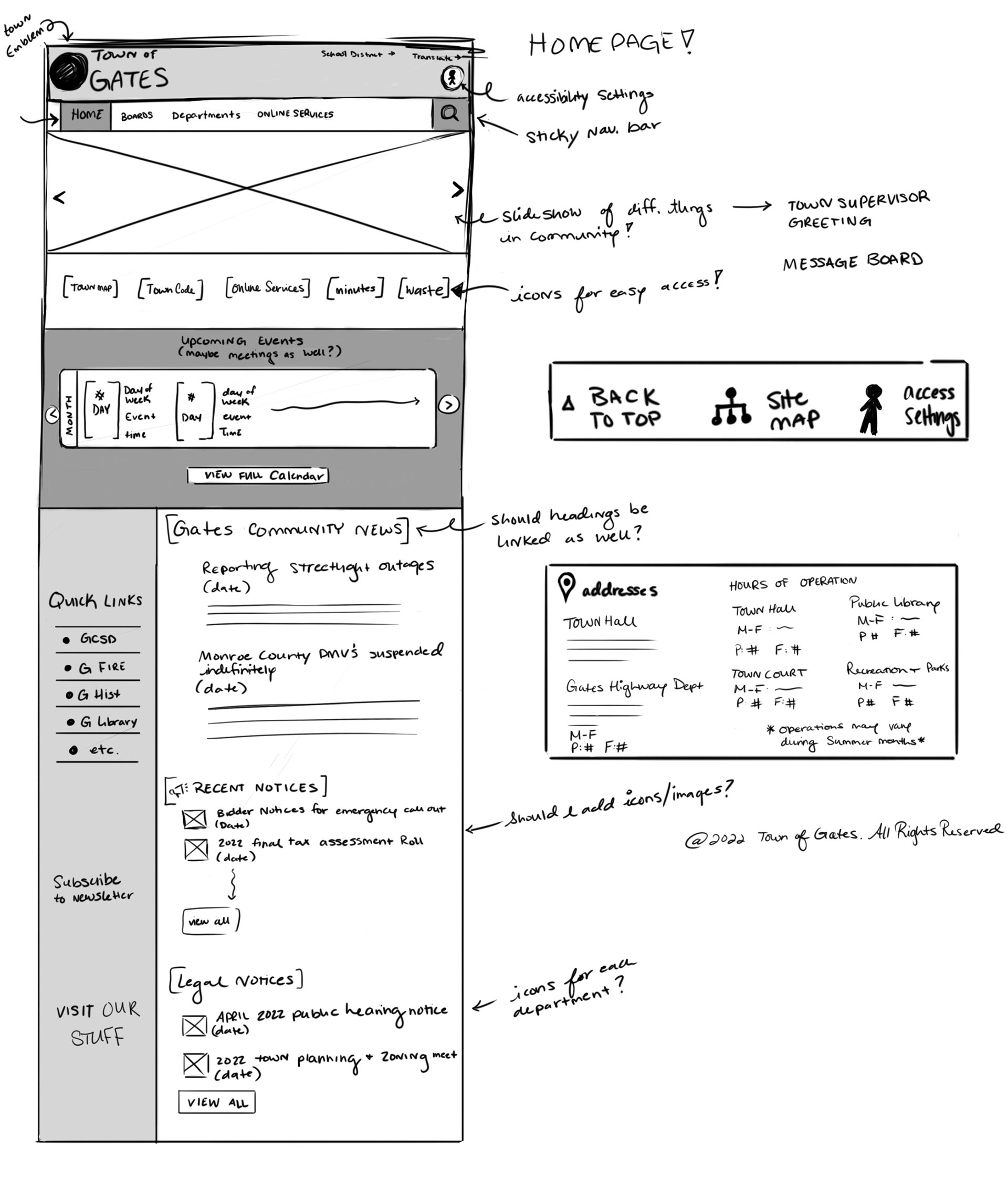
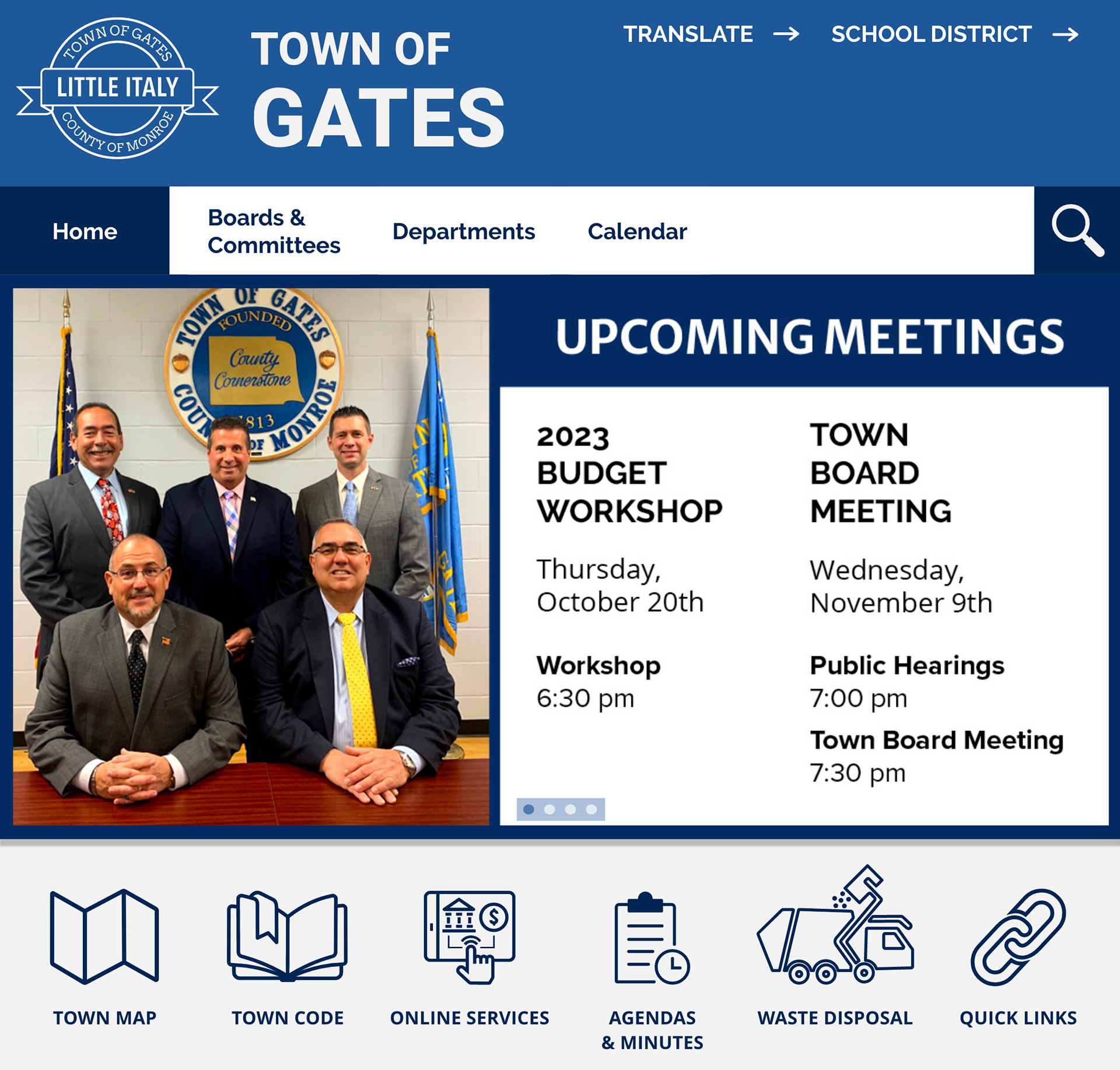
In order to create an easier navigation system I needed to create a proper site map for the town website.
This turned out to be more tedious than I had hoped, as their current site map is a bit discombobulated.
Rather than having an endless supply of links that one has to read through, I instead chose to design simple icons as a way to compartmentalize all of the information into an easy to navigate user experience.
Iconography
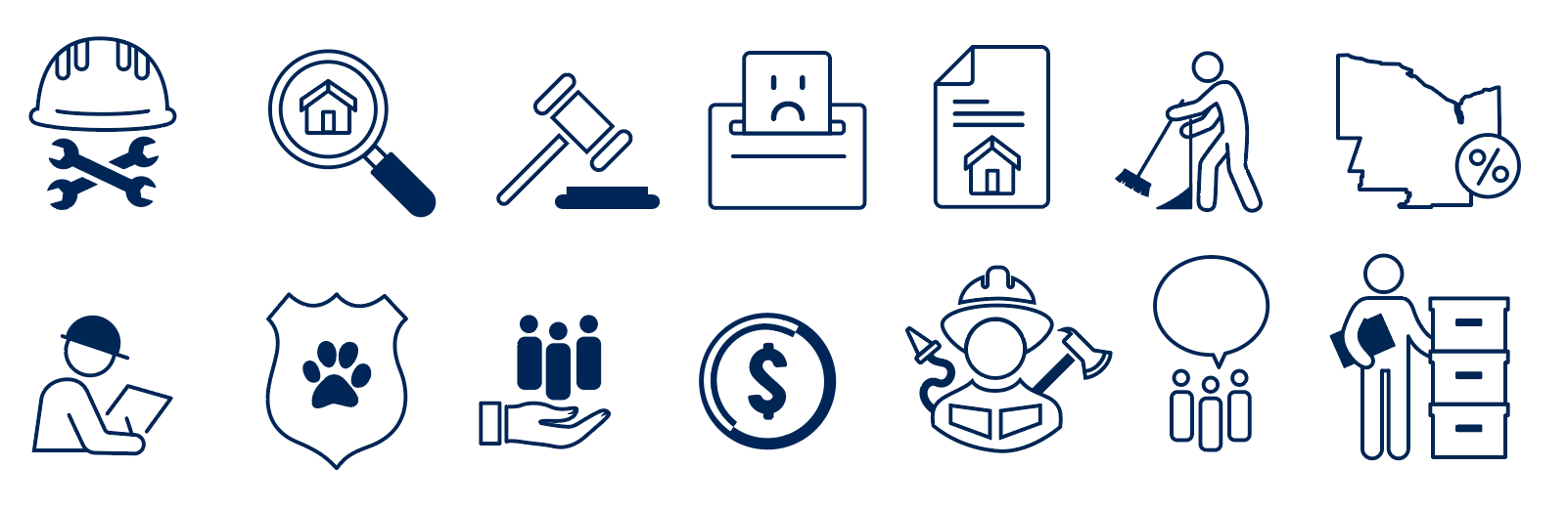
This is only half of the icons designed exclusively for this new site
These icons were designed with the user in mind, as the average user will be from an older demographic. These icons, along with larger text, will help lessen eye strain and hopefully avoid users from getting lost while navigating the site.
The designs of the icons are also there to help people understand what each department handles.
For example, the second icon in the first row is for the Assessors Department, where people's home and property can be assessed.
User Experience


With large icons, larger links, and a color palette more suitable for the town, navigating this new town website has become a whole lot easier.
I created all of the icons and followed the design system used by the GCSD to create a more welcoming and professional looking town website.
The sections I predict will be most utilized by users are on the starting homepage and are always accessible, no matter what section of the site you are on.
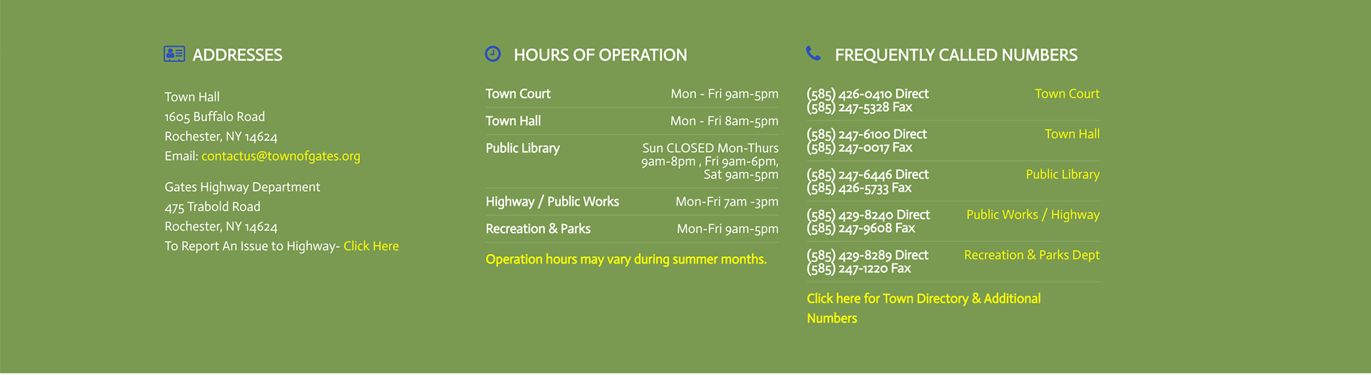
My crowning achievement, in my opinion, is making the footer more understandable at a glance. No more "frequently called numbers" section.
My favorite section that I worked on was the library page. Since the Gates Public Library has its own updated website with fun colors and interesting graphics, I thought to include some of that vibrant personality to the town website as well.