Overview
From an early age, one of my aspirations in life has been to write my own book. This was fueled by my desire to see more diverse and inclusive stories. As a Latine neurodivergent individual, I recognize the importance of representation in literature, especially in children’s books.
Twice Exceptional not only fulfills a childhood dream but also serves as a beacon of empowerment for young readers who may find solace and inspiration in seeing themselves reflected in the characters and themes of the story.
Research
Our senior capstone is a year long project split into two semesters. In the fall semester, our main focus was on research! Throughout this semester my research consisted of conducting book audits, reading articles on neurodivergent children, as well as reading children's books (both new and old).
Below is my research presentation that features almost all of my research for this project. The reason why I say "almost all" is because I continued to conduct research well into the spring semester. I like to say that the research portion of any design project is never fully complete, as there is always more we can learn.
Character Design
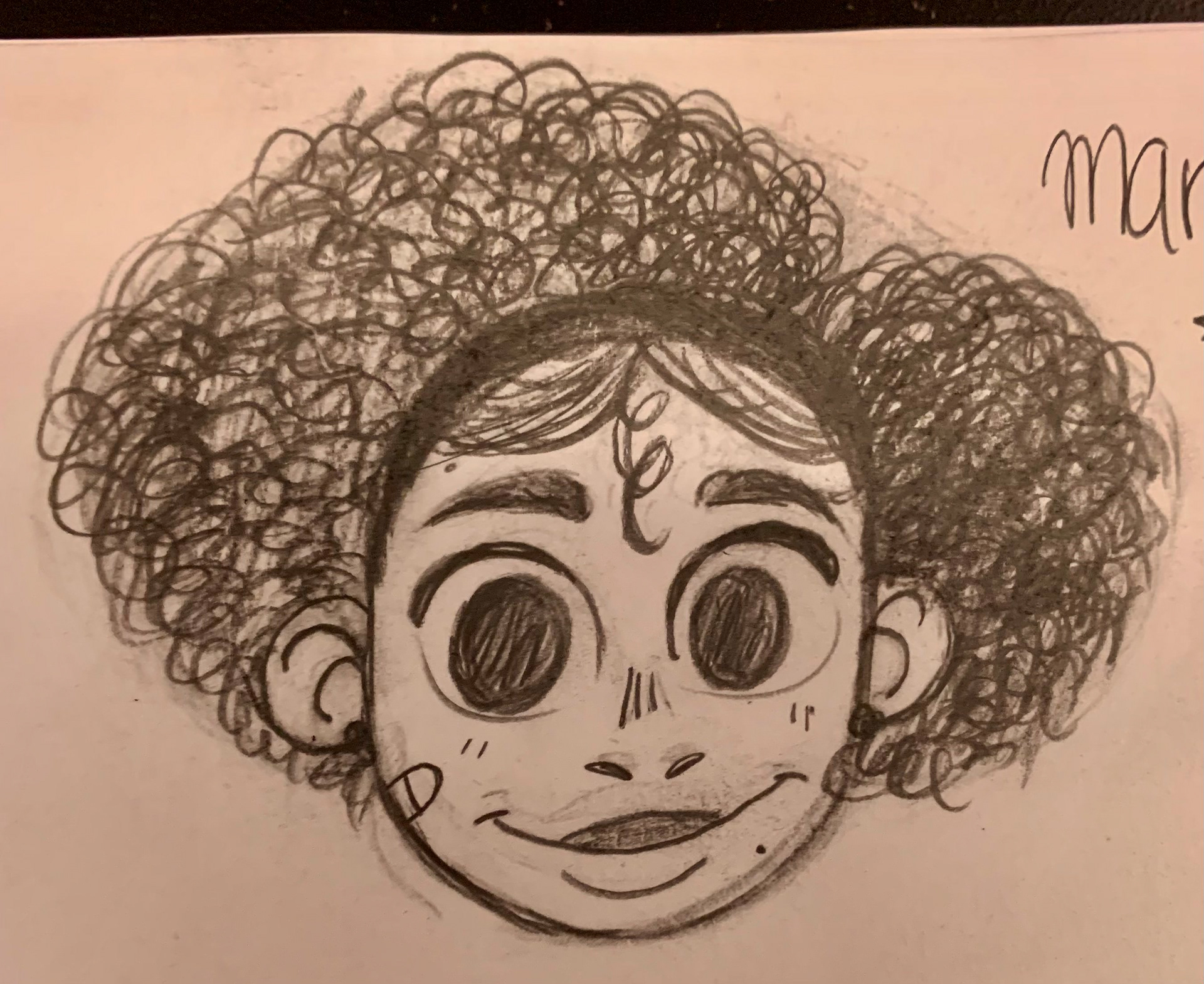
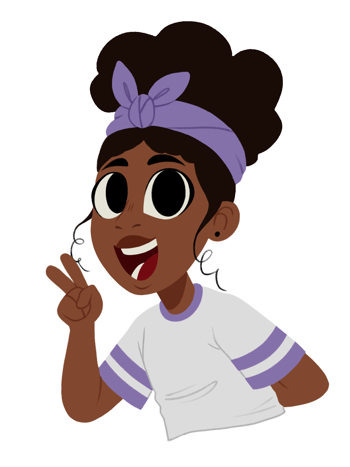
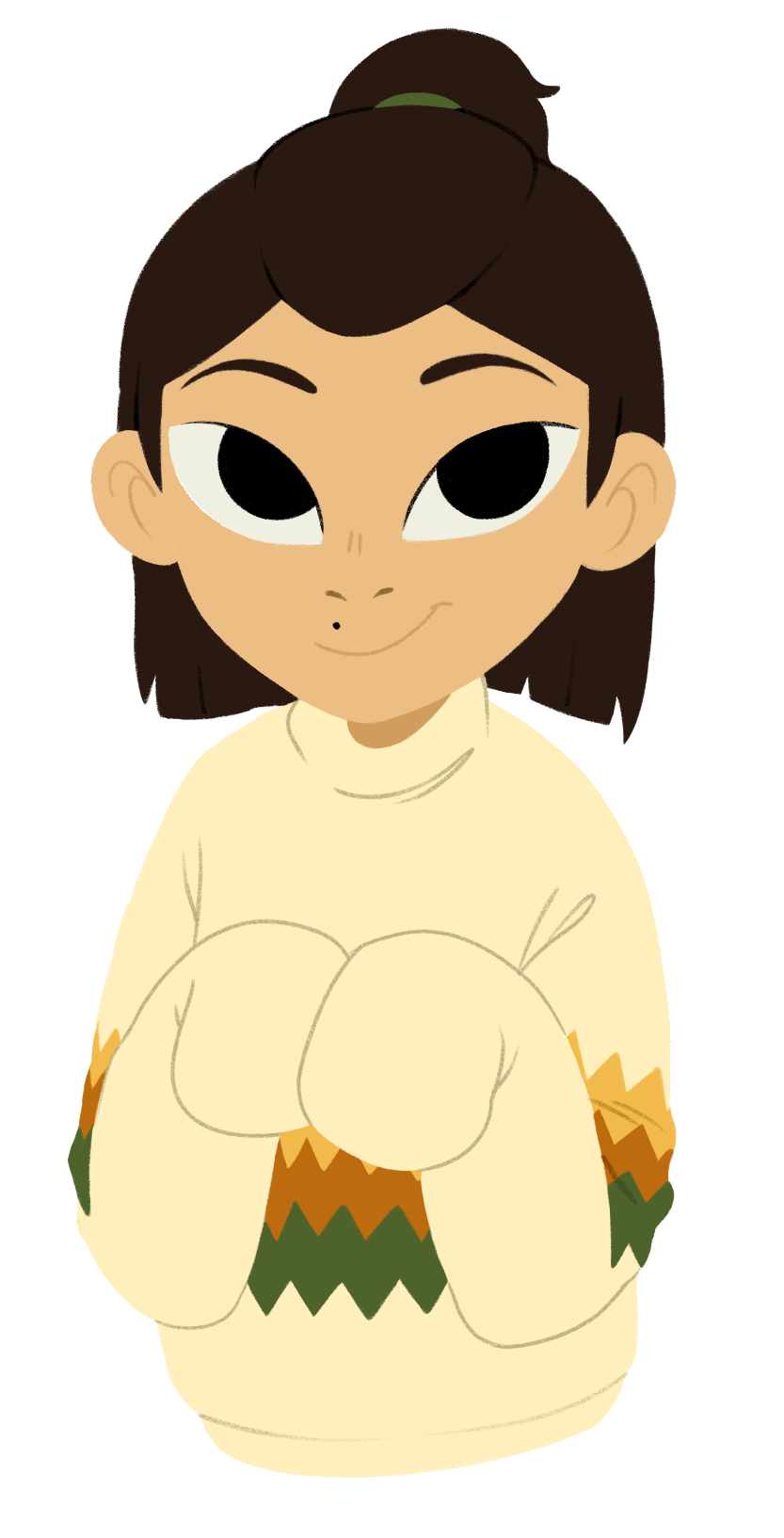
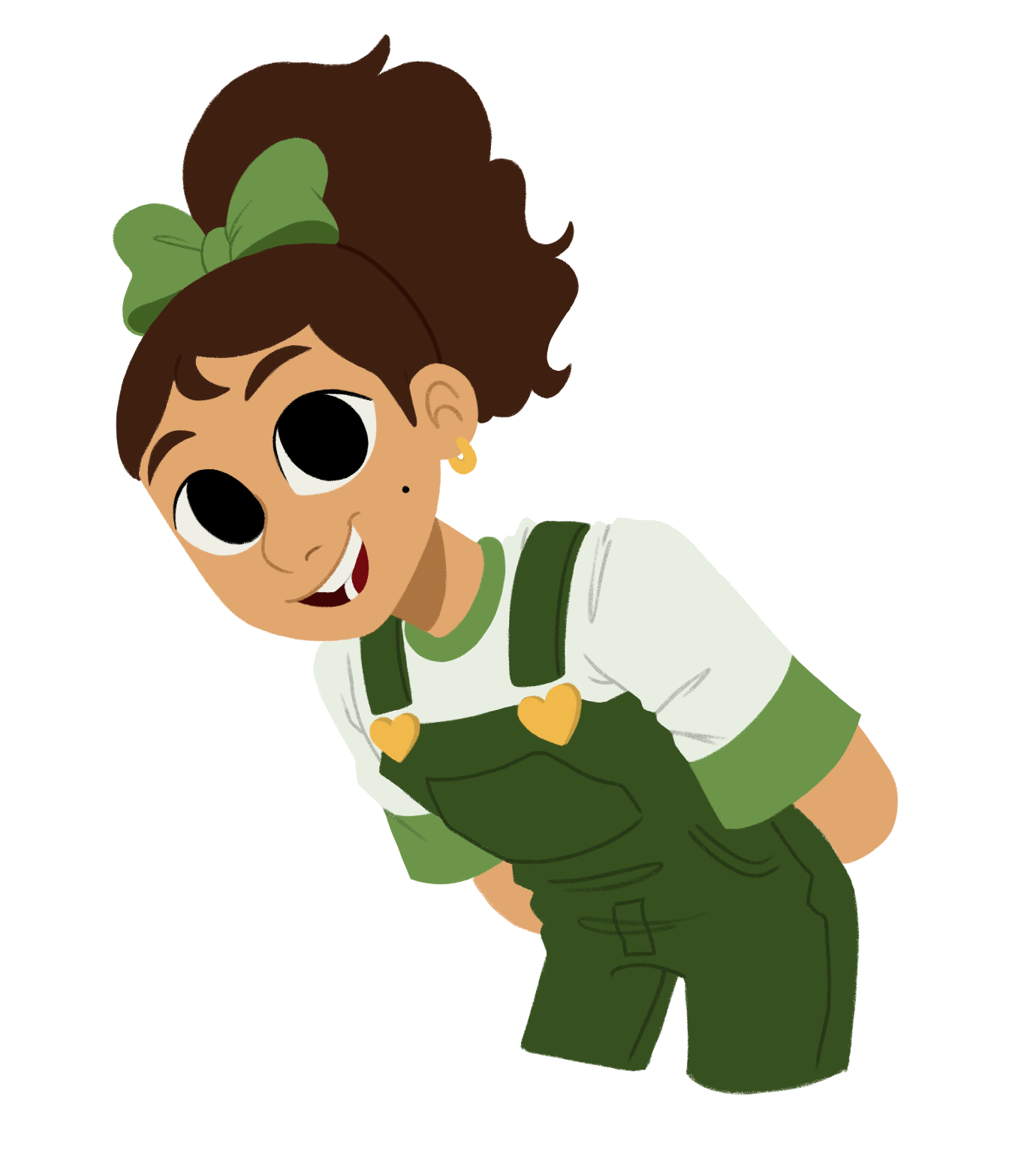
This was by far the most fun part of the entire process. At first I didn't really know where to start, but after getting some solid advice (Thank you, Brooklyn America!) I decided to base my book around a trio of friends who are neurodivergent. From there I began to sketch-out some characters.
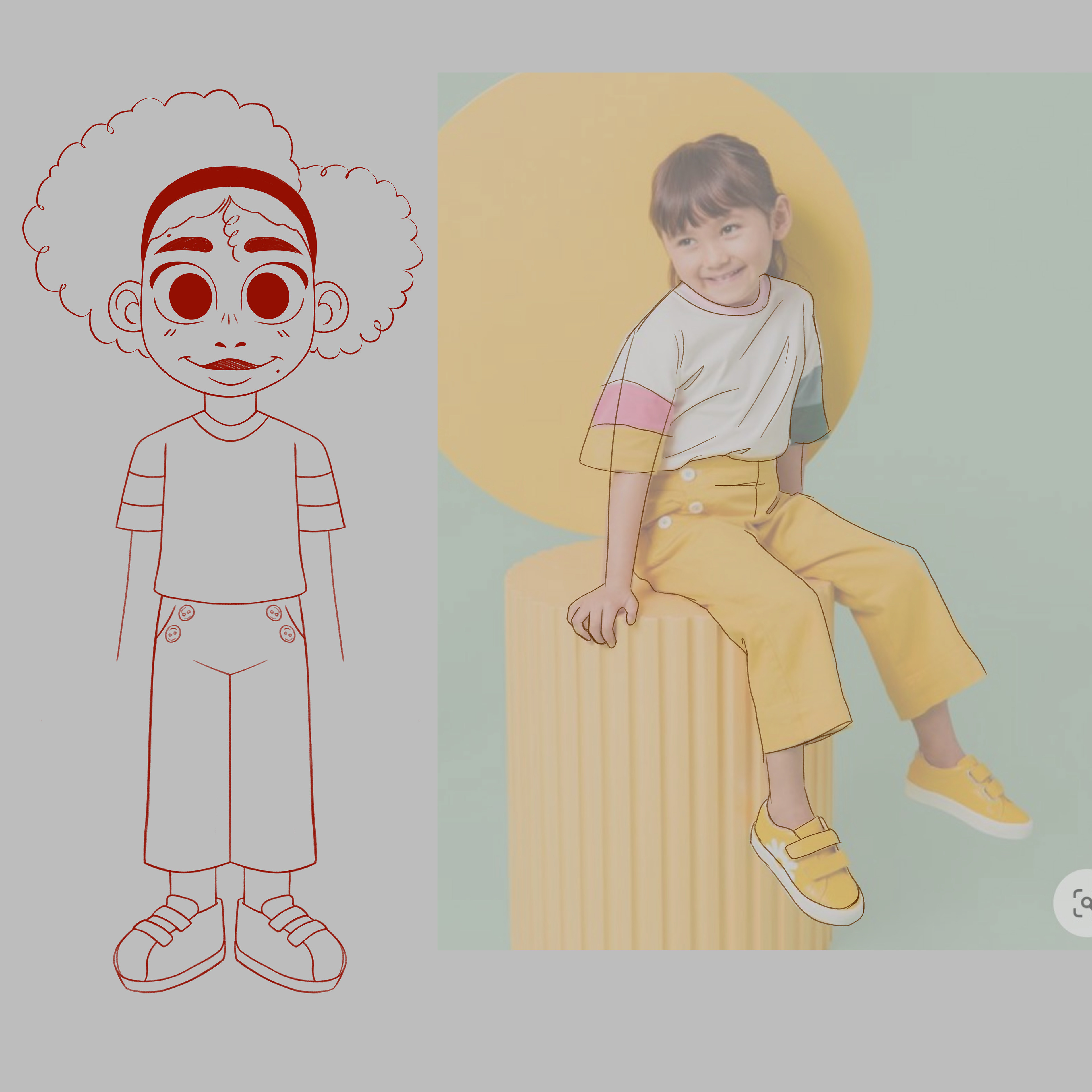
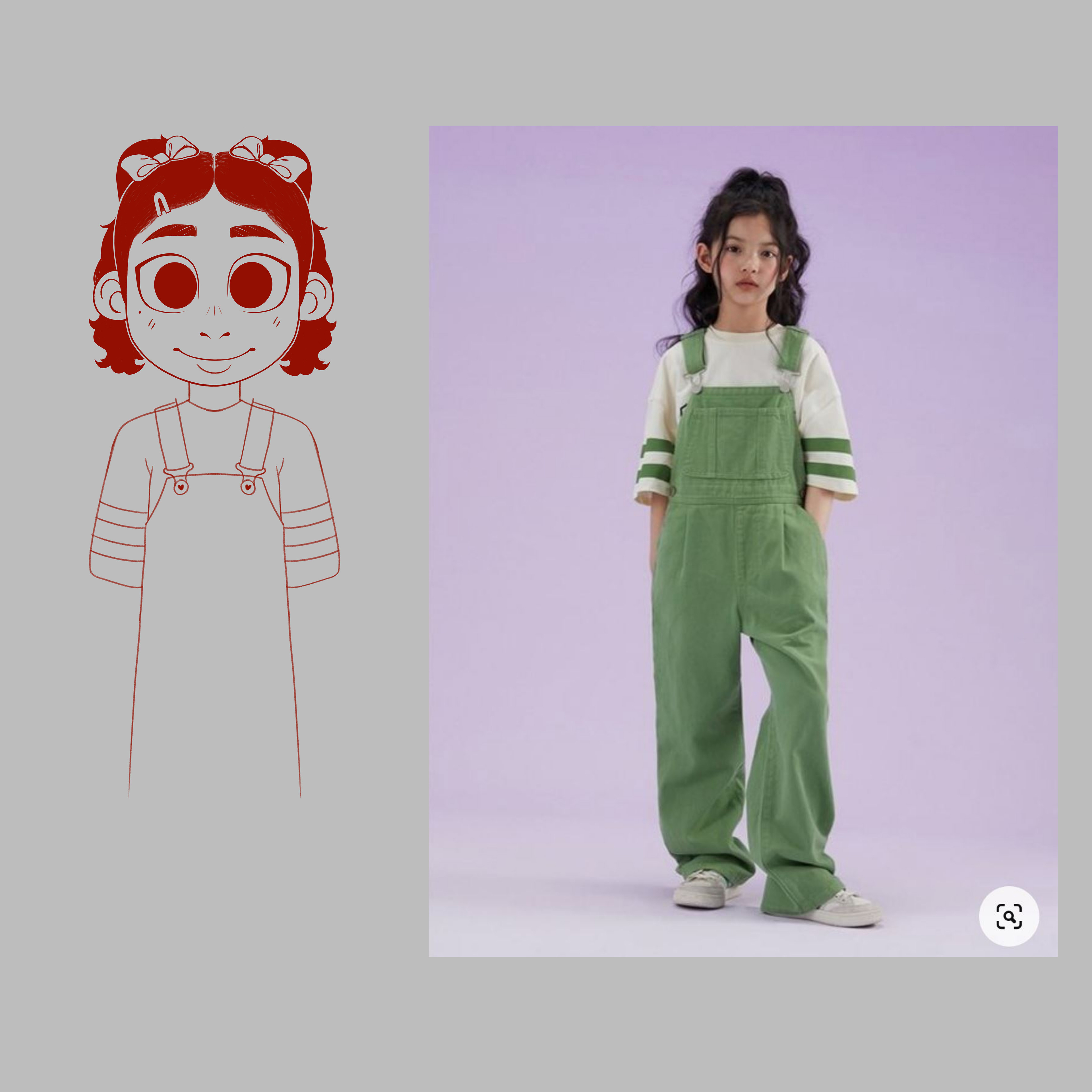
When designing the main characters I tried to explore different illustration styles and tried to get myself to step out of my comfort zone. Very early on I was heavily inspired by French children's book illustrator Zoé Ruth Plane (instagram: @puppy.au.lait).

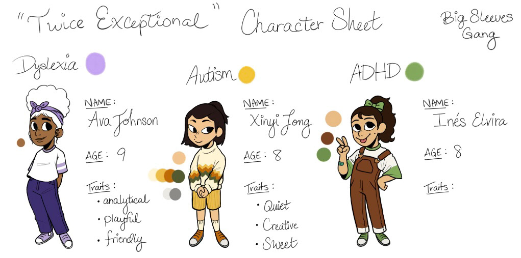
This is my final character sheet. I used this reference religiously.
Story Writing
I have never considered myself a writer. Most, if not all, of my written work has been for school assignments. And yet, I have always wanted to write my own book one day. I knew from the very beginning that I would struggle with this portion of my capstone, but I never realized it would be so time consuming!
I knew that the storyline had to come first. Before any illustrations or design choices could be made I needed to have a story to go with it. At first I tried my hand at writing a narrative driven storyline, but this approach made me focus too much on the dialogue between characters and the story began to read more like a novel than a children's book story.
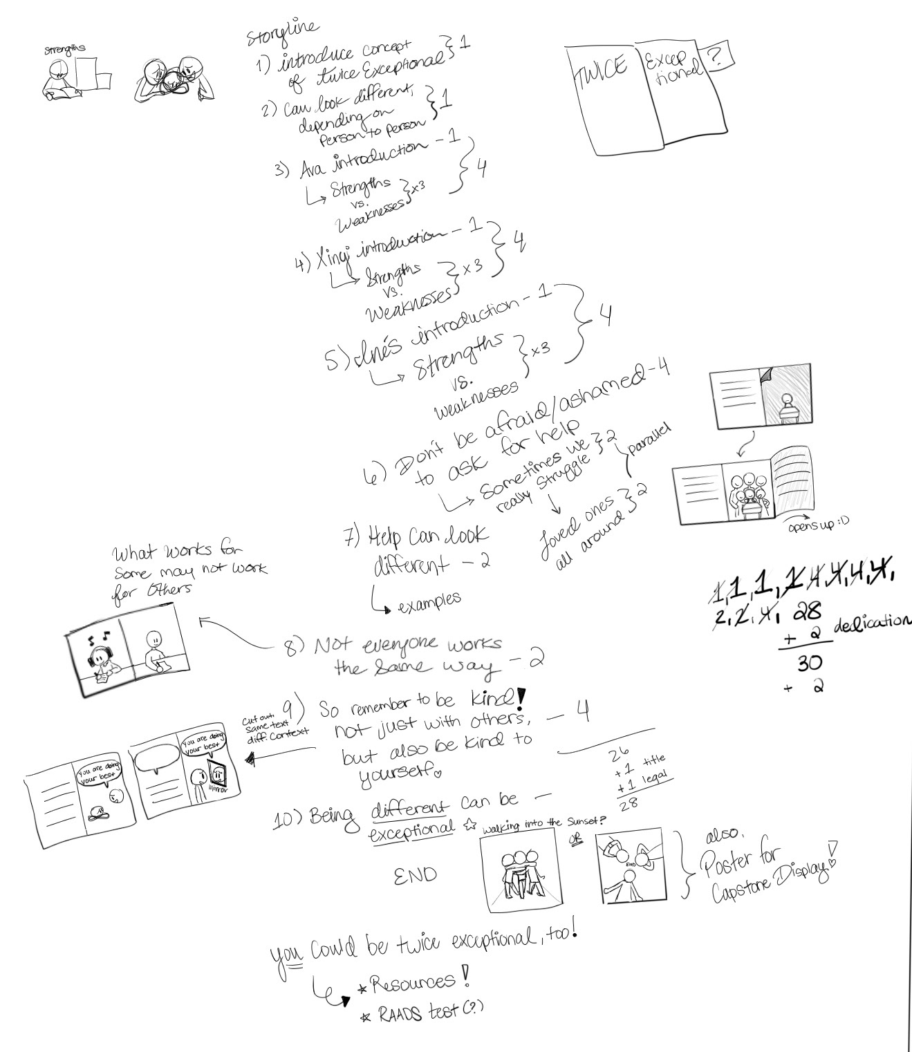
That is until one day I forced myself to write down everything I wanted to include in my book—the topics I wanted to cover and how I would approach it illustration-wise. By breaking down the story into individual pages and spreads I was able to create the skeletal-structure for my story, one that I could then build off of.
Although chaotic and a bit slanted, this image served as a starting point for my story. The thumbnail sketches scattered about the page were page designs I actually used in my final rendition of the book. The numbers to the right of the text are supposed to convey the number of pages each section should roughly be.
Dyslexia-friendly Typeface

Click the image above to visit their website!
While writing my book, several people recommended that I use a dyslexia friendly typeface for my body copy. I agreed whole-heartedly and began to research what typefaces were the easiest to read. During my research, the fonts "OpenDyslexic" and "Dyslexie" were the most talked about in regards to legibility. Although I myself am not dyslexic, I found these two typefaces to be not only difficult to read but also really unappealing to look at. Further research revealed a study done that proved these typefaces were no better than other standard typefaces on the market.
I soon discovered an old reddit thread where actual people with dyslexia recommended their favorite typefaces. It was there that I was introduced to "Omotype." This typeface was not only highly legible and easy on the eyes, but "Omotype" also has a round and friendly appearance that was perfect for my book! I immediately reached out to the type foundry and asked for permission to use it. Unbelievably, they were generous enough to gift me the extended typeface to use in my book, with the only contingency being that I share my finished product with them!
Bookbinding Styles
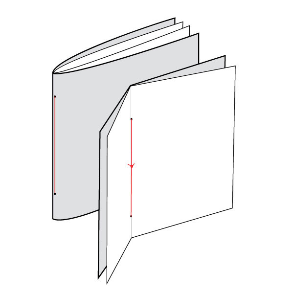
Pamphlet Stitch
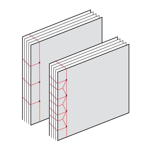
Japanese/ Stab Binding
My initial thought when it came to printing and binding the finished book(s) was to have my story professionally printed, possibly via a book publishing company. As self-imposed deadlines came and went I realized that printing through a third party would be too much of a risk in terms of turnaround time. While contemplating my options I decided to join the new RIT Bookbinding Club. It was during the first meeting of the club that I truly considered binding the books on my own.
While researching bookbinding styles I came across a TikTok where a mother was shown ripping apart a book for her autistic son, as he preferred to read them in a certain way. I thought it was fascinating and subsequently chose to bind my books with a more "temporary" binding technique. In the end, I chose two distinct binding styles: the first being the Pamphlet Stitch and the second being Japanese Stab Binding. I chose these two binding styles as their exposed thread design makes it easy to take apart.
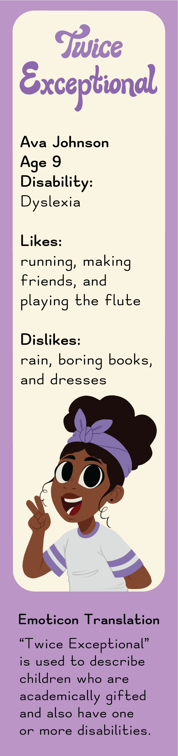
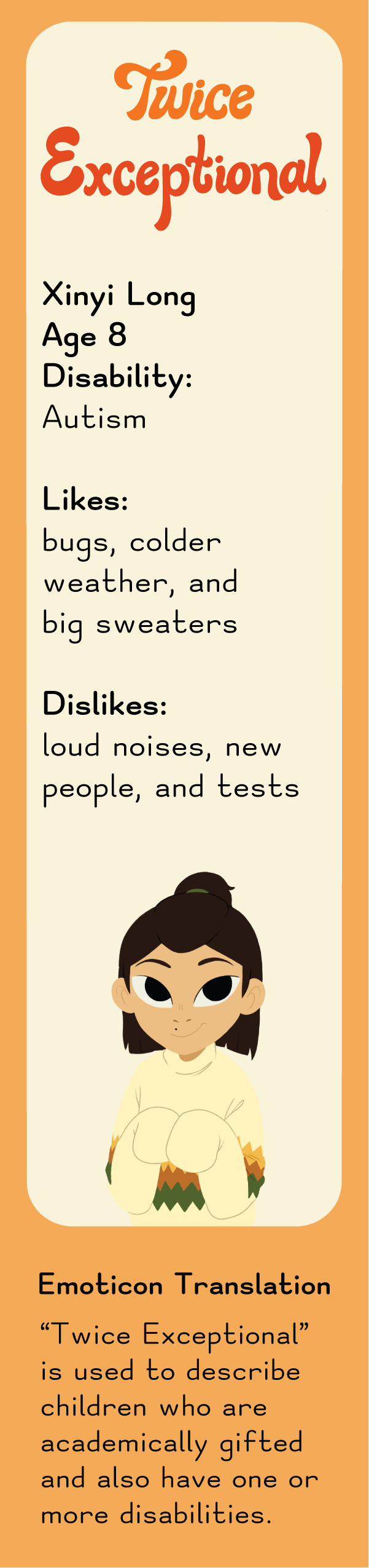
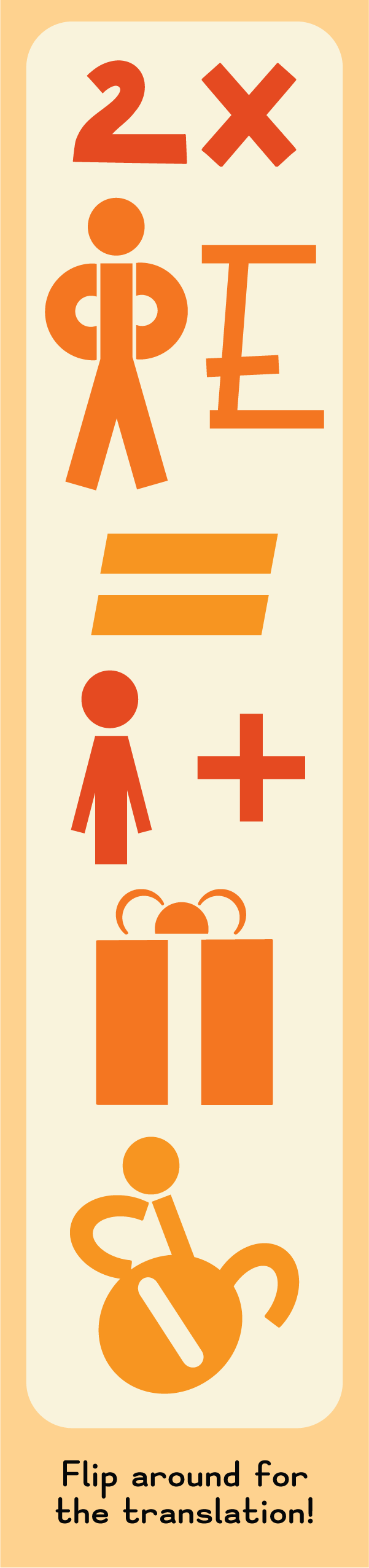
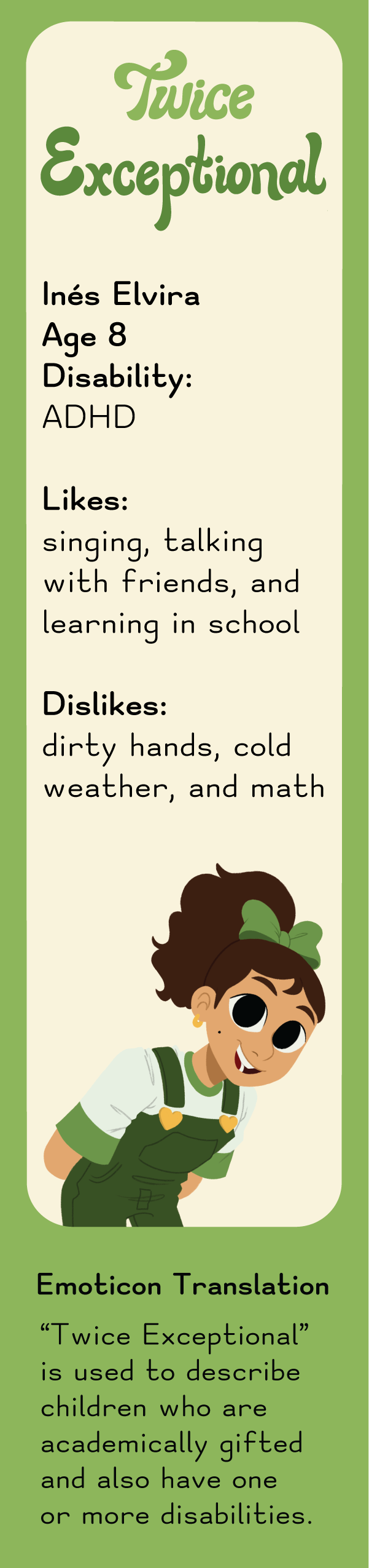
Bookmarks
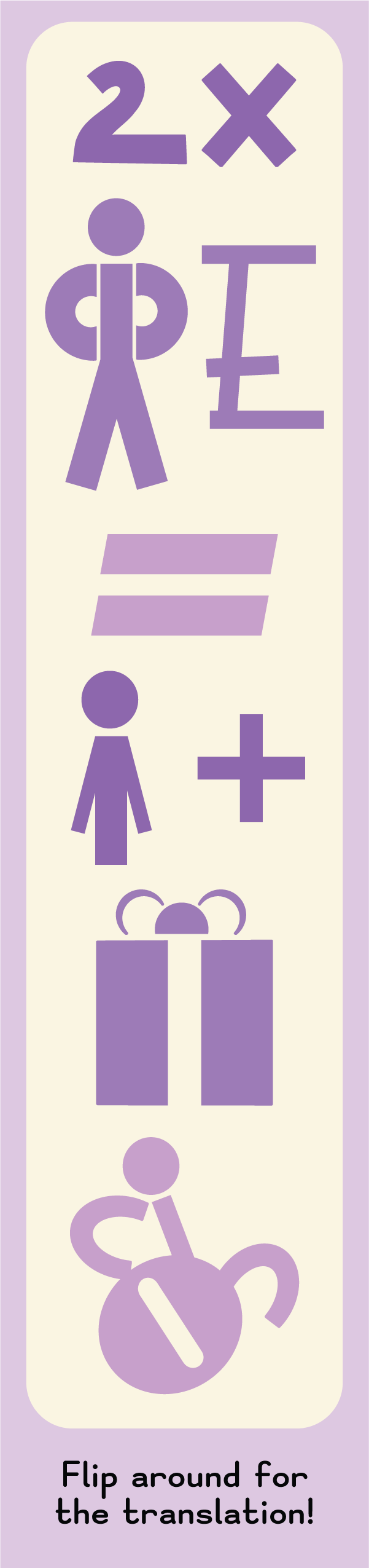
The bookmarks were designed with the capstone show in mind. I wanted to include something that visitors could take home with them. With that in mind, I decided to design 3 different bookmarks, each highlighting 1 of the 3 main characters. The bookmarks feature some interesting facts about the character, as well as a set of emoticons on the flip-side. These emoticons represent what it means to be 'Twice Exceptional'. But why Emoticons?
Its common for neurodivergent children to attempt to create their own secret language. Researchers believe this is their way of trying to finally be understood. I chose to use Emoticons as they can be universally understood. This wordless approach was inspired by "Book from the Ground" written by Bing Xu—a book without words, recounting a day in the life of an office worker, told completely using only symbols, icons, and logos of modern life.

Senior Capstone Show & Imagine RIT Showcase
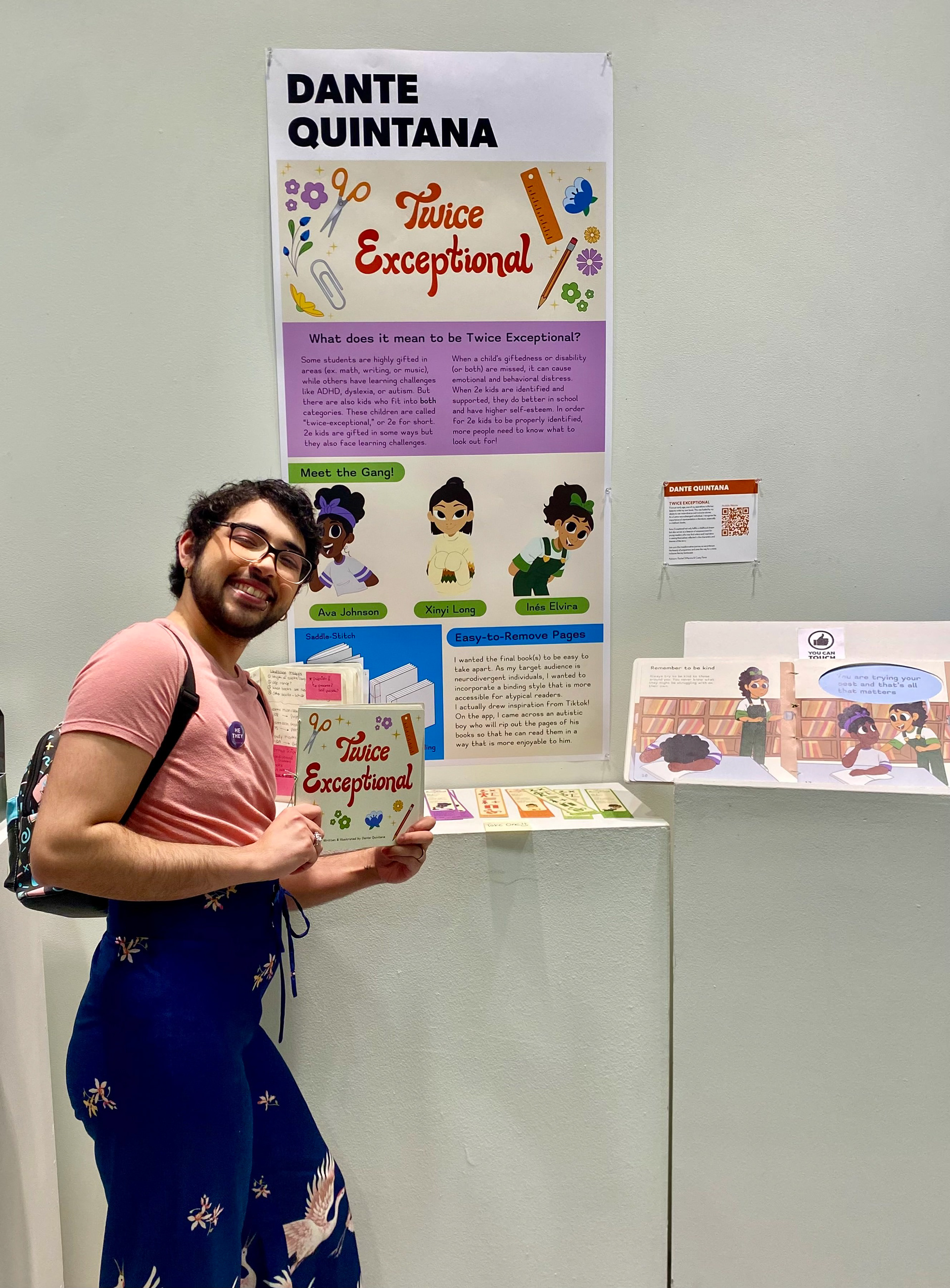
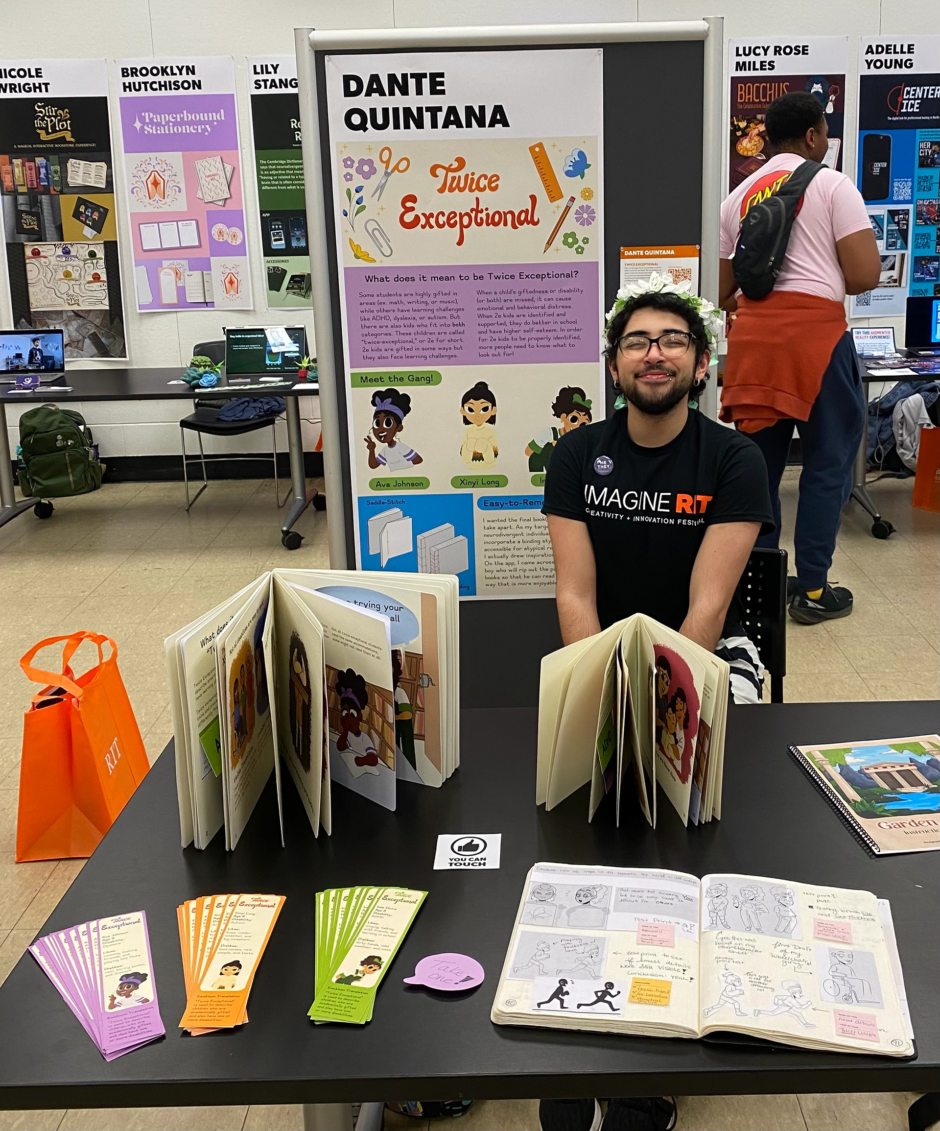
I displayed my finished project in two exhibitions. For both events I had on display two copies of the book, my process notebook, the informational capstone poster, and 60 free bookmarks (120 in total)! The first exhibition was in the RIT University Gallery where my work was on display from April 15th until April 20th.
Imagine RIT is the signature event held at the Rochester Institute of Technology (RIT) that showcases the imaginative and creative spirit of RIT students. I have exhibited at Imagine RIT in the past but never on my own. This was a huge opportunity I knew I couldn't pass up! I had quite a lot of fun interacting with all of the visitors, and this experience really helped me gain more confidence in my design work.
now what?
After I had finally finished printing, binding, and setting everything up for the show(s) I found people asking me: "What's next?" Truthfully, I hadn't had the time nor energy to really think about that question. After having spent the last few weeks fighting a losing battle against Adobe Fresco, I was ready to be done with this project. Unfortunately, I can't in good conscience say that I am truly done with this book.
I was honestly quite shocked when nearly every person that read through my book asked me if I had gotten it published. Every time I said it was not and most likely wouldn't be, people expressed their desire for me to go through with it. Several people even took photos of the cover of my book so that when it was published (not if) they could grab a copy of their own. I'm kind of excited and a lot scared, but publishing this book seems like the only logical next step in my design career.