
Overview
The PUSH Graphic Design Workshop at RIT is a creative workshop that helps PUSH Graphic Design students out of their comfort zone. By working with students to think outside the box, this design workshop helps students strengthen their design thinking skills and helps them better their overall critical thinking skills.
Unfortunately, PUSH did not have a proper logo at the time, so I set out to design one for them! This is my favorite project that I have worked on so far, this is mainly due to the several "eureka" moments I experienced while working on it. As you will see from my process work, my starting point differs greatly from the finished piece.
Concept sketches
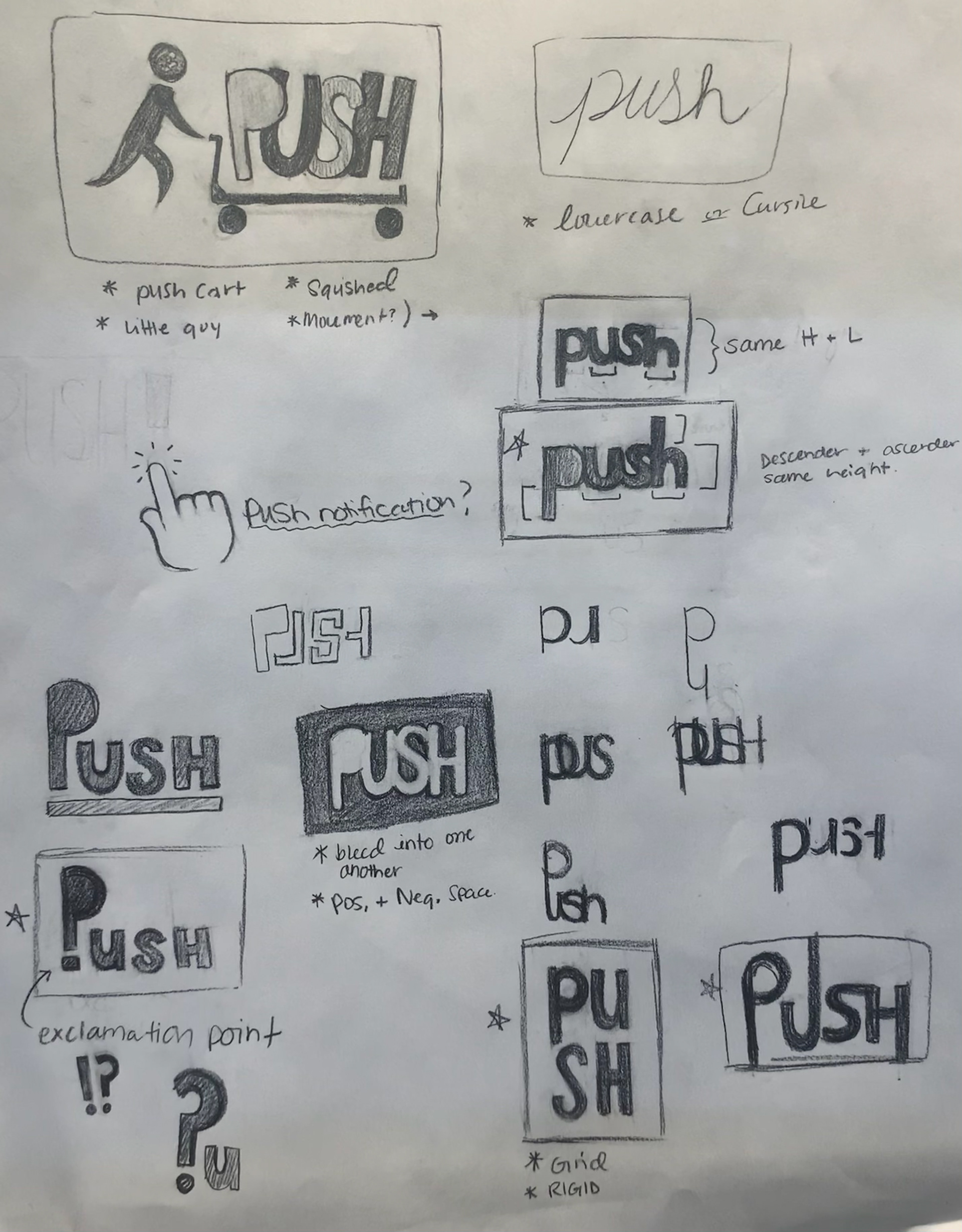

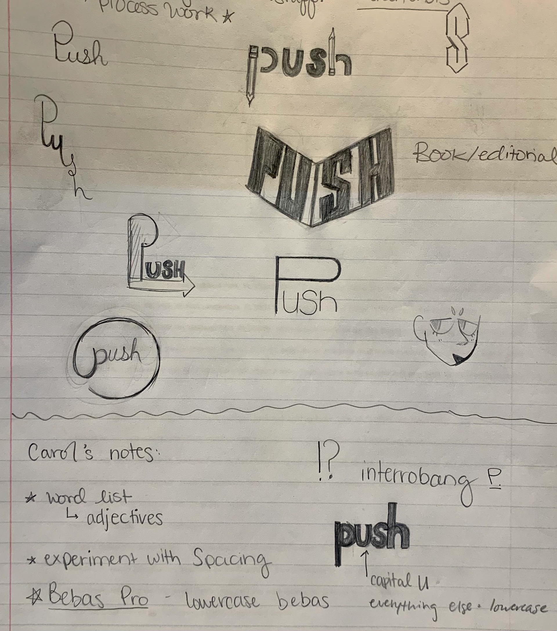
In the beginning, I chose to start with several concept sketches. Although I decided to take a more typographic approach with this in the end, in these sketches you can see I tried variety of different icons and imagery that could work alongside the text. In the spirit of PUSH, I chose to lead with a more typographical solution as I had less experience with it at the time and I wanted to PUSH myself outside of my comfort zone.
My main goal for this logo was something iconic and easily identifiable. I wanted it to be versatile yet fun to match with what the workshop is all about. I did research on past PUSH workshops and took inspiration from them. In one of my notes to myself at the top of the second page, I mention working to emphasize the 'U' in PUSH somehow in order to show the focus is on "you."
Initial Type Studies
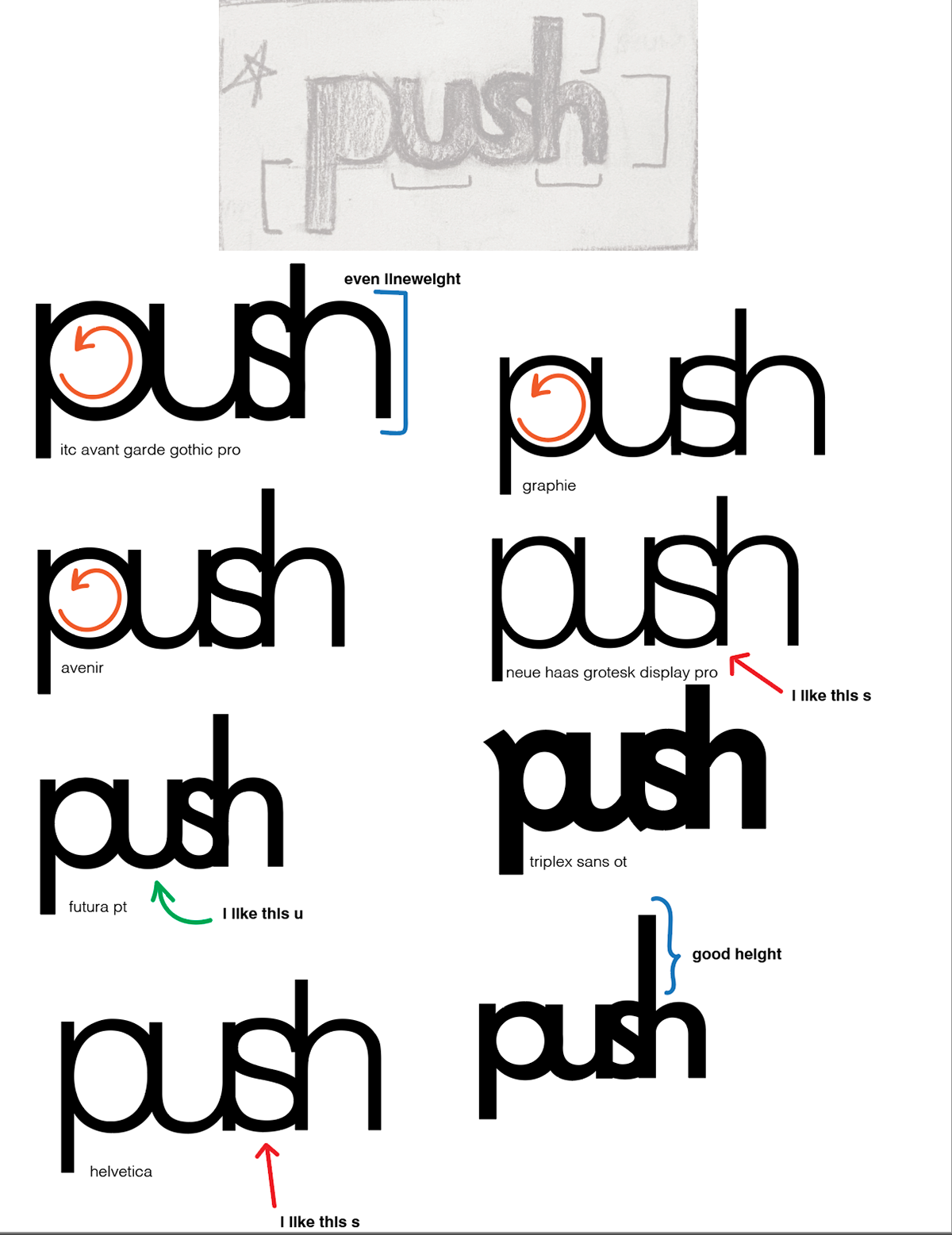
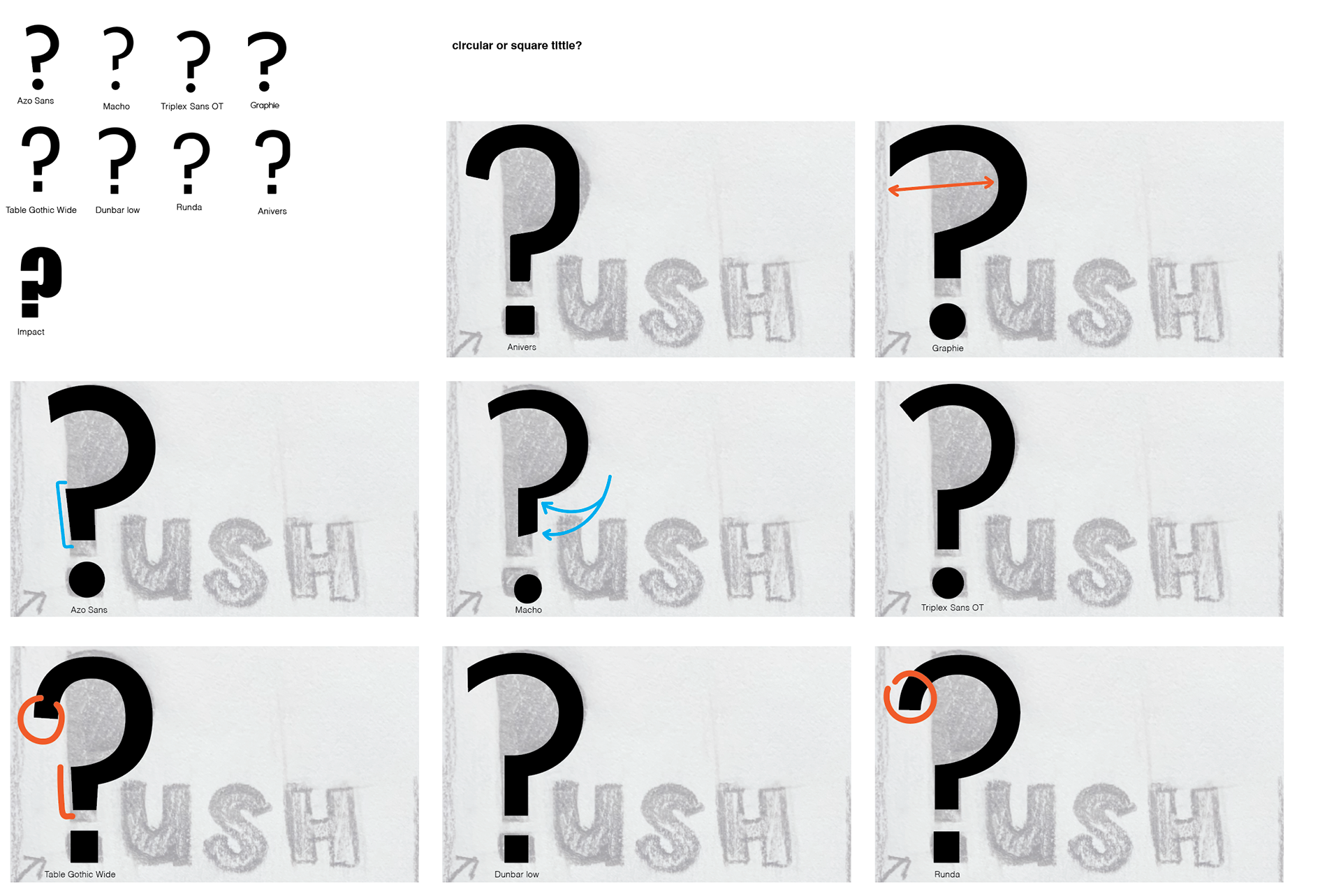
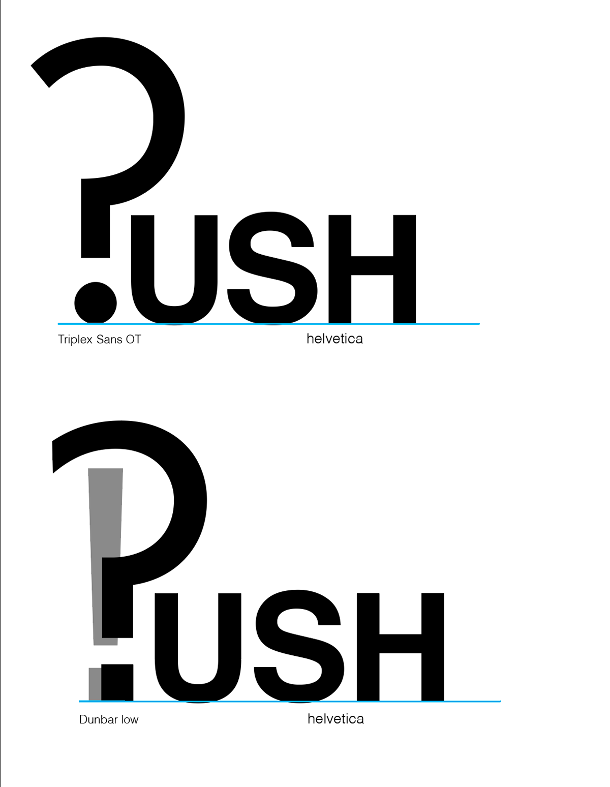
My first few concepts relied heavily on type, therefore I made several type studies in order to find the typeface(s) that best suited my design.
Unfortunately, the designs I put together just didn't feel right. They all felt like they were missing something...
Unexpected Eureka!
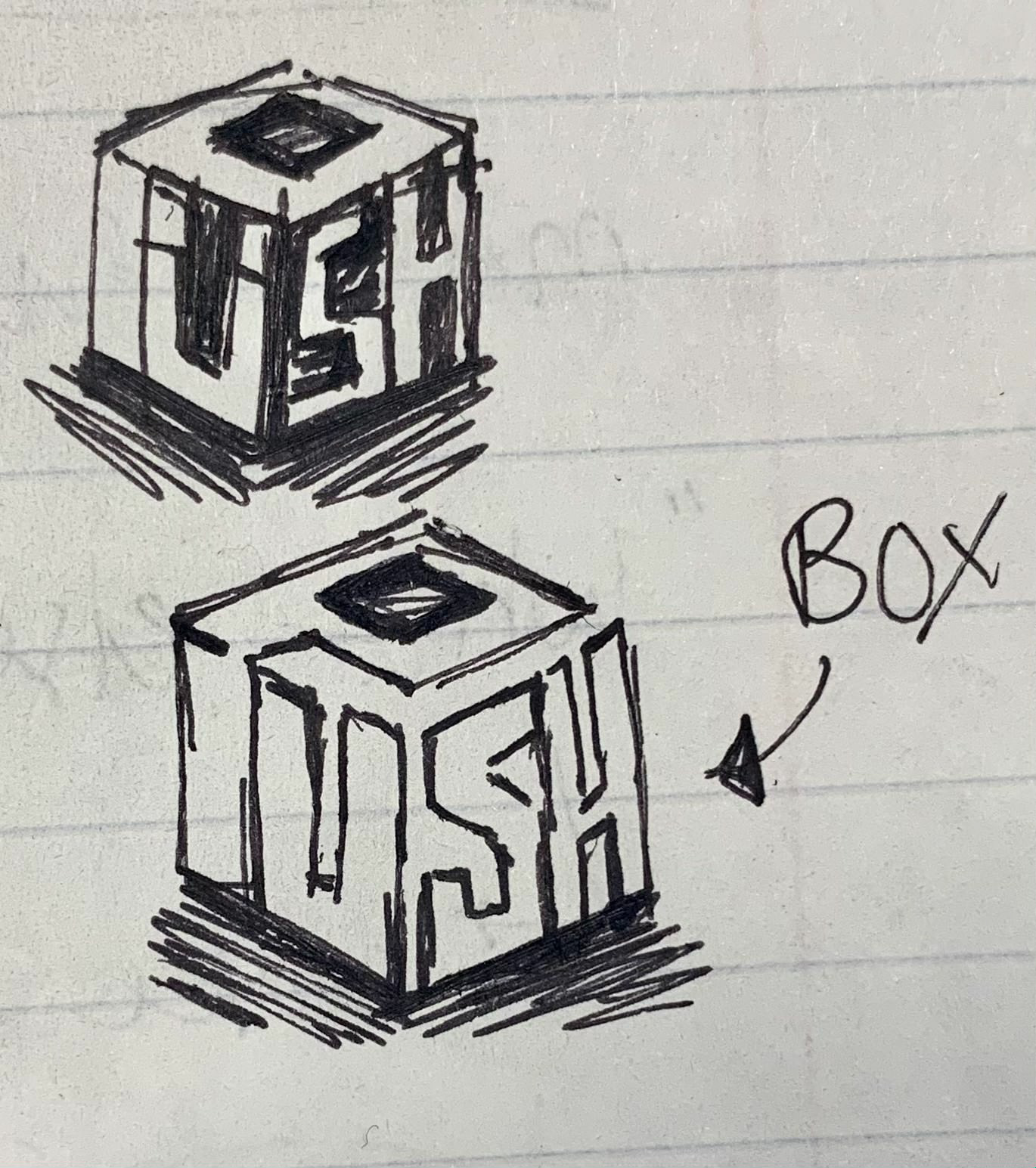
One evening while doodling in one of my notebooks, I decided to sketch out some more logo concept ideas. I didn't expect to come up with a new idea that felt more concrete than any of the previous designs I had been working on for weeks! I felt that this design captured the essence of the push workshop a lot more than any of my previous designs.
It has the playfulness and fun aspects that come with a creative workshop, while also maintaining a level of rigidness and structure that is needed in order for students to learn.
At this point in time I had to make a choice: either continue with my original concept(s) OR "kill my darlings" and essentially start from scratch.
PUSH-ed Through!

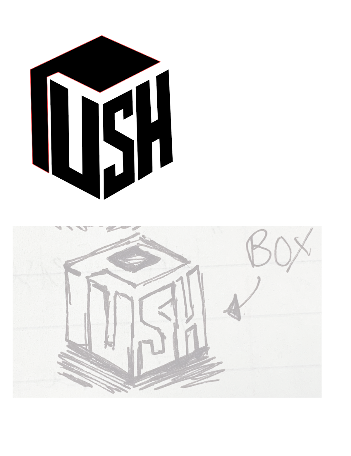
At a certain point in my process I hit another wall: How do I take this new concept and make it into a proper logo with a brand identity?
Thankfully, one of my professors told me exactly what I needed—an isometric grid!
Once I started aligning my type to the isometric grid it finally started to take shape! This new silhouette of the type created a shape that led me closer to the final concept.
Thankfully, one of my professors told me exactly what I needed—an isometric grid!
Once I started aligning my type to the isometric grid it finally started to take shape! This new silhouette of the type created a shape that led me closer to the final concept.
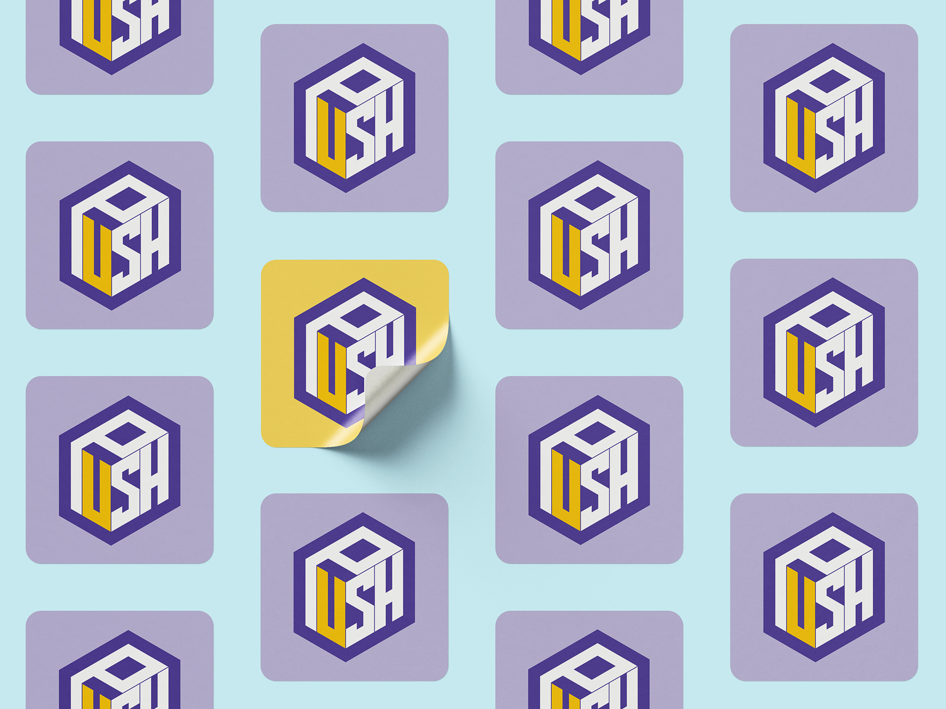
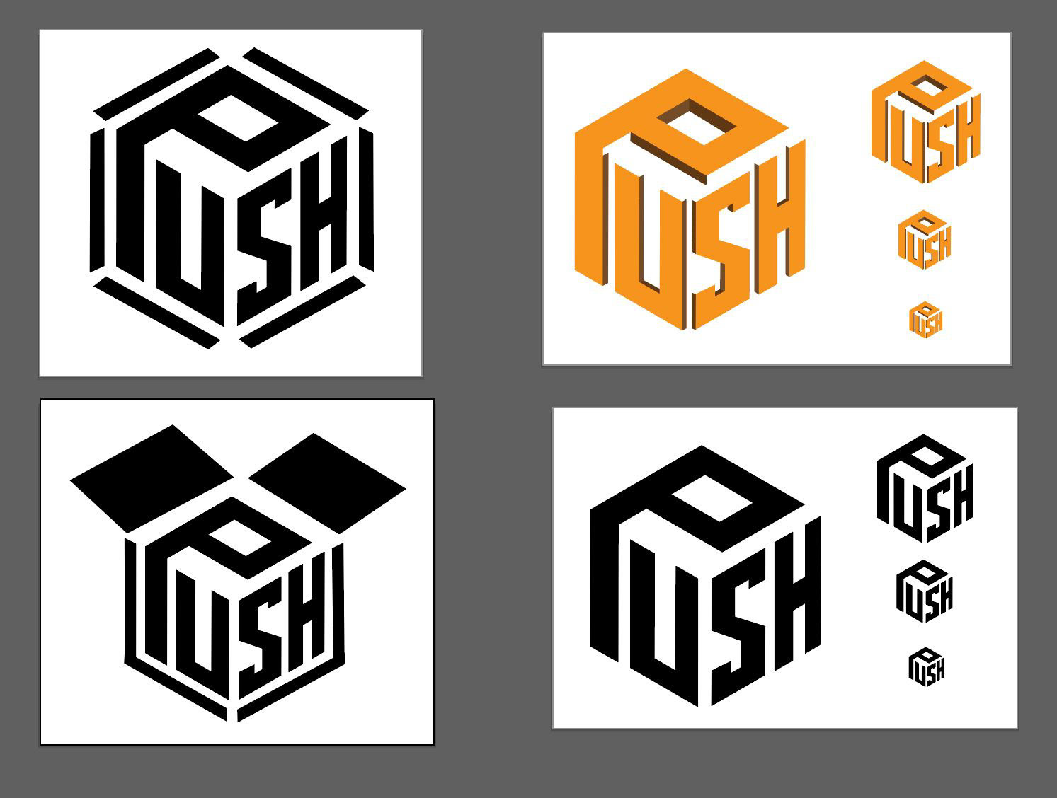
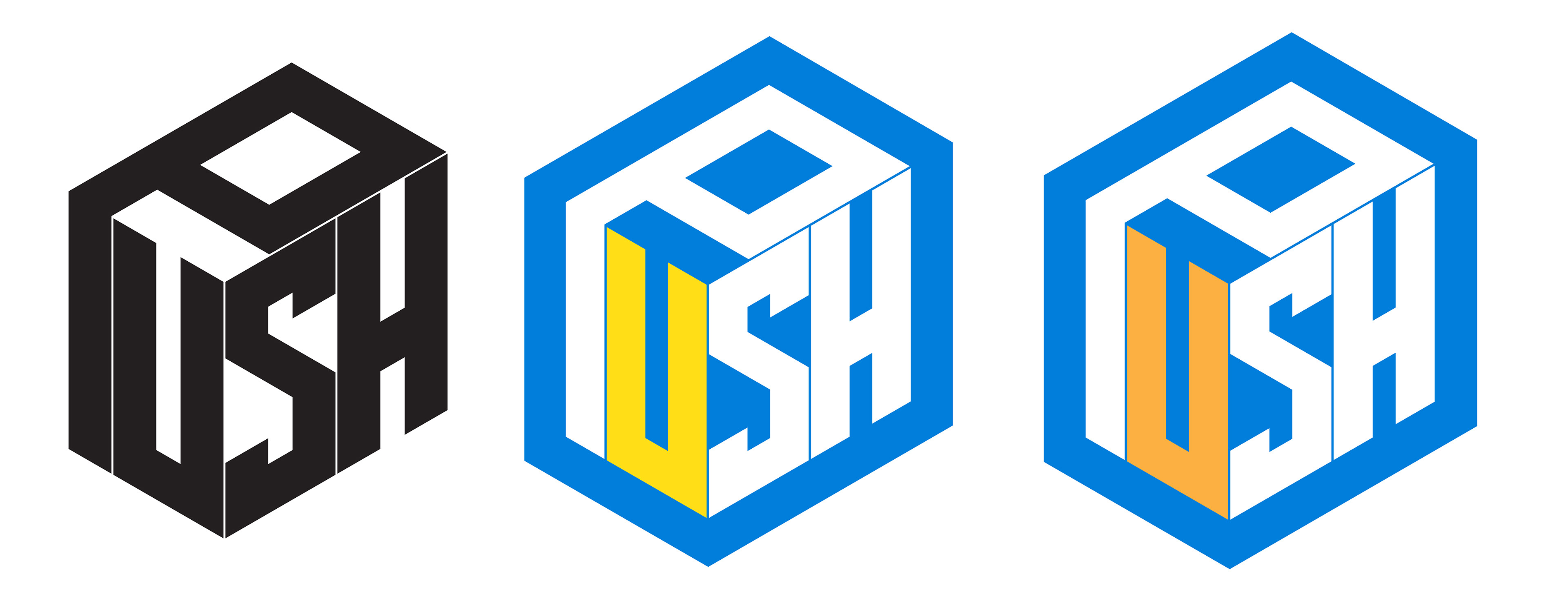
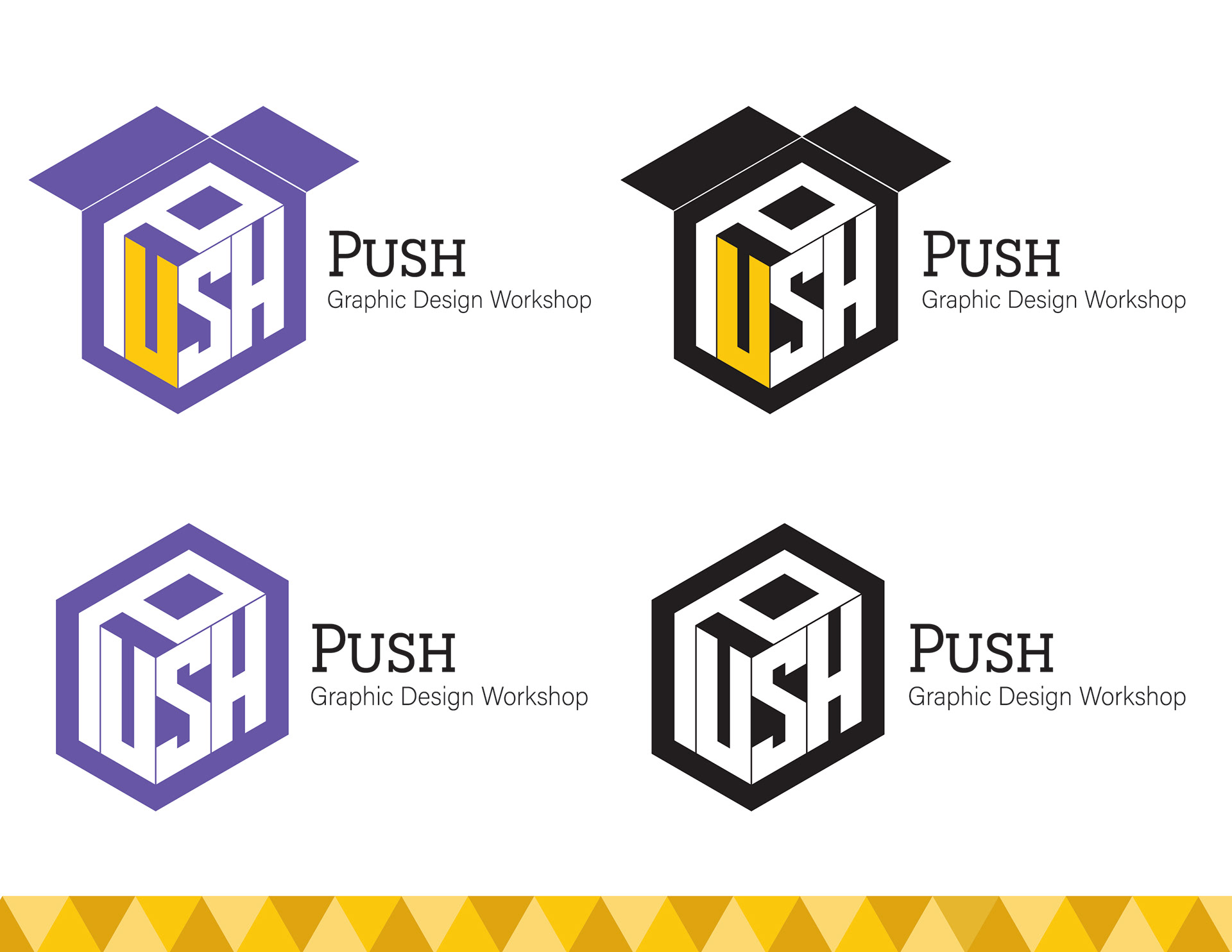
From there I decided it was finally time to choose a color palette. This was purposefully left for last as I didn't want color to be a defining characteristic for this logo. It needed to be intelligible in black and white, as well as in color.
While deciding on a color scheme I chose to add another pop of color somewhere. As a big fan of complementary colors, I chose to incorporate yellow as an accent to the blue logo designs.
While deciding on a color scheme I chose to add another pop of color somewhere. As a big fan of complementary colors, I chose to incorporate yellow as an accent to the blue logo designs.
As I was contemplating where to place the new accent color, I was reminded of my earlier concepts where I tried to add emphasis to the letter "U" through different means.
Final Design
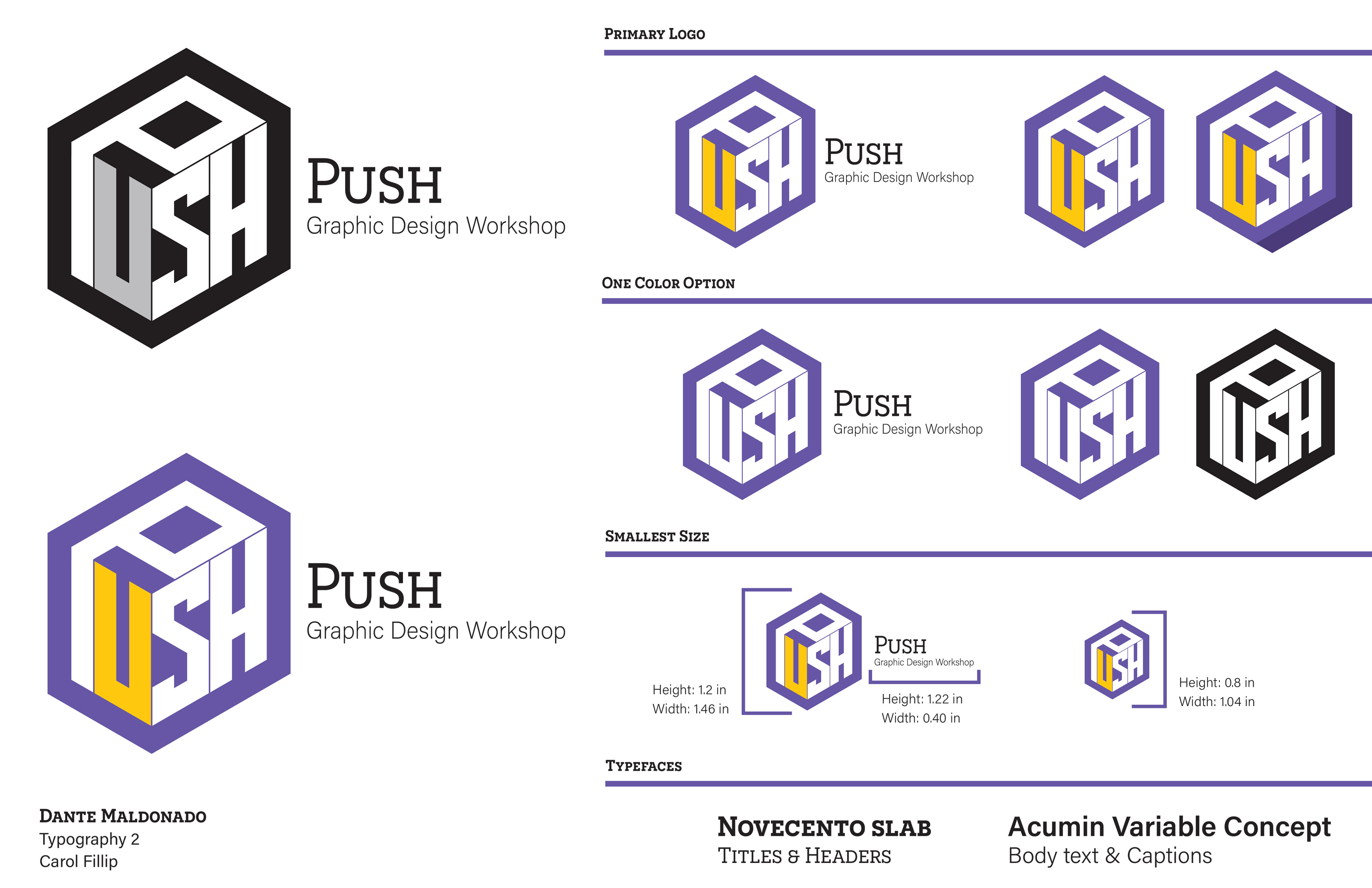
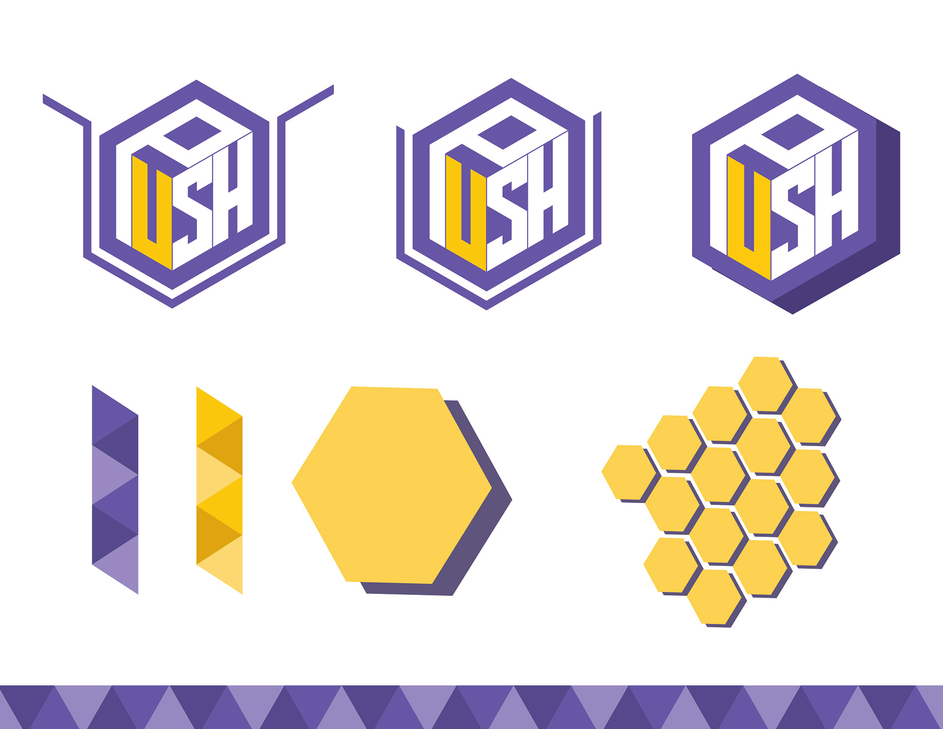
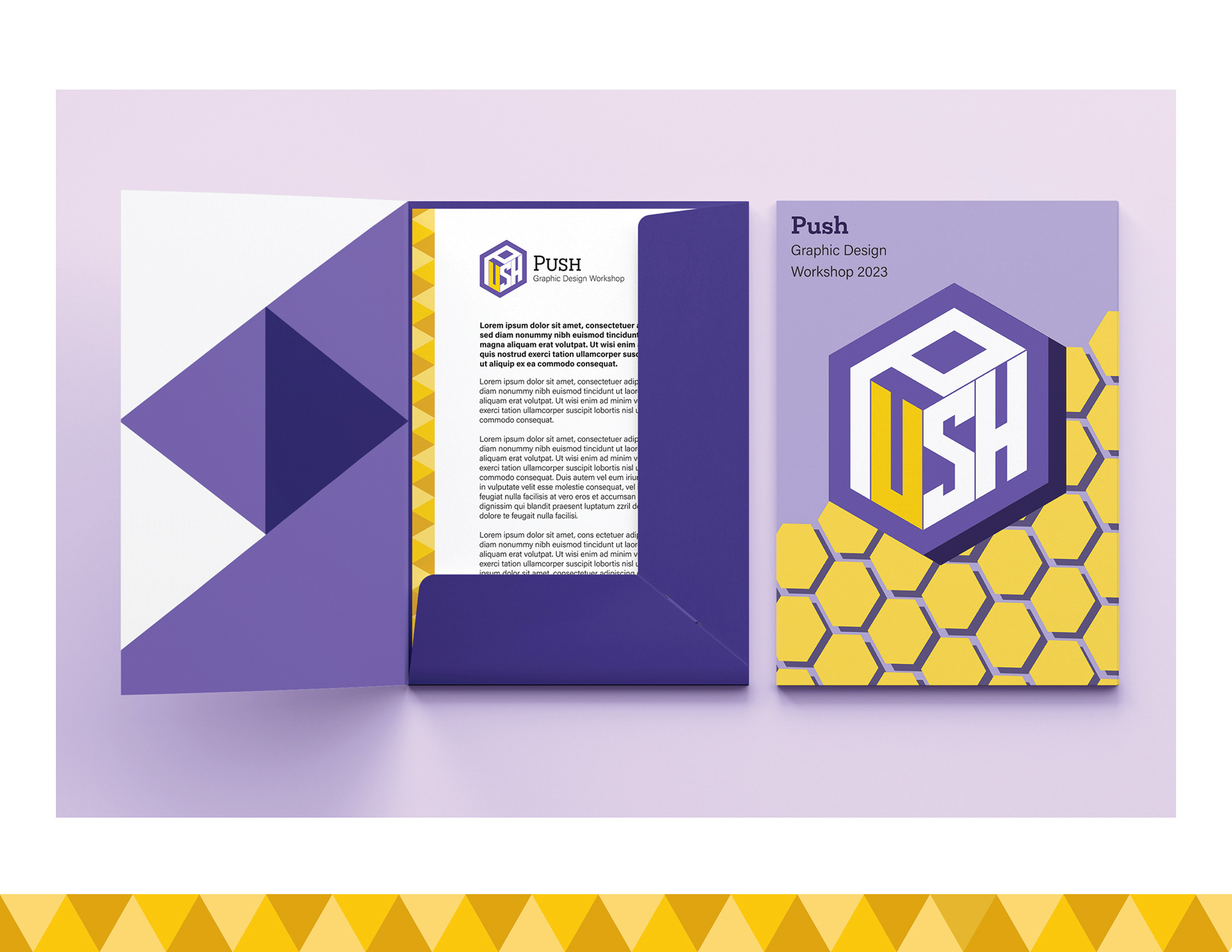
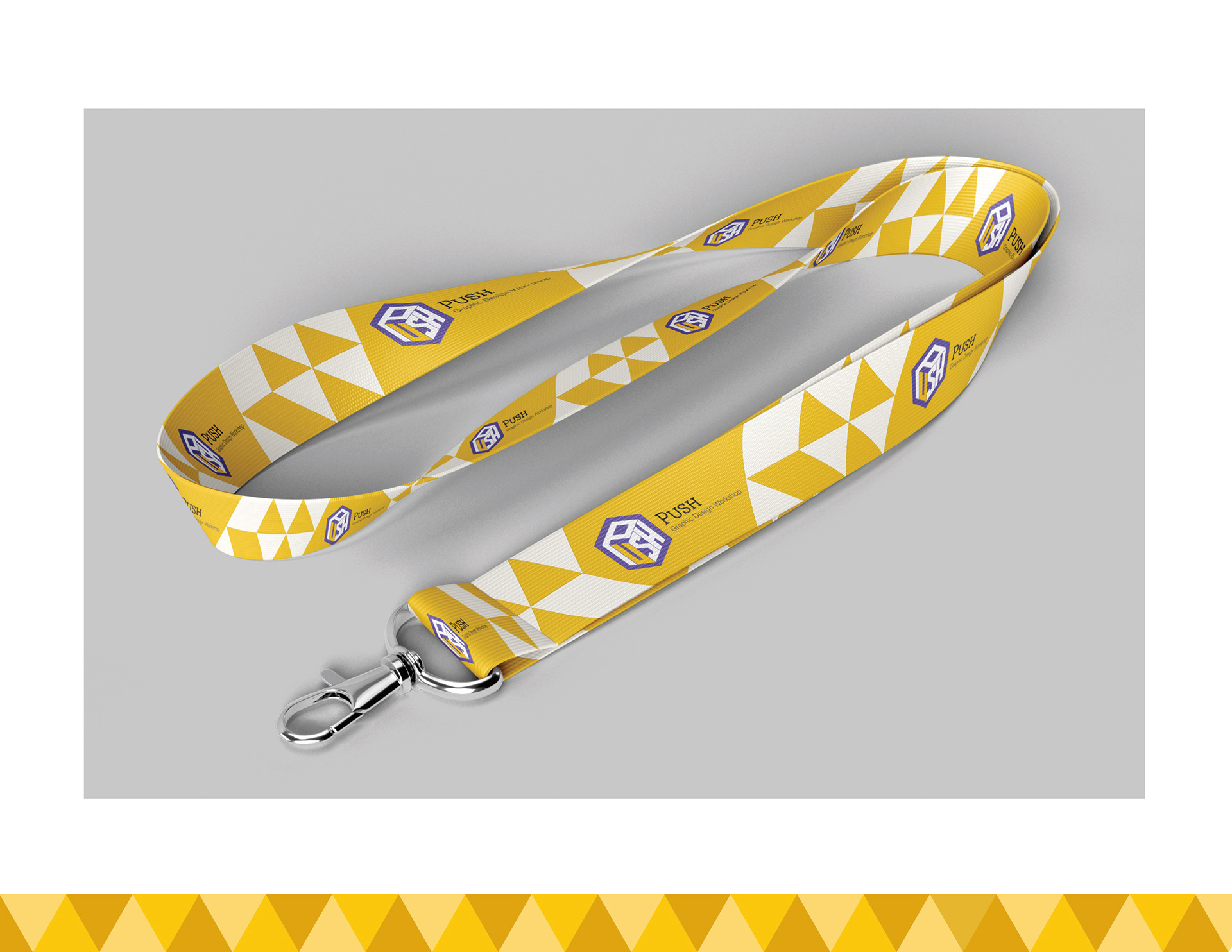
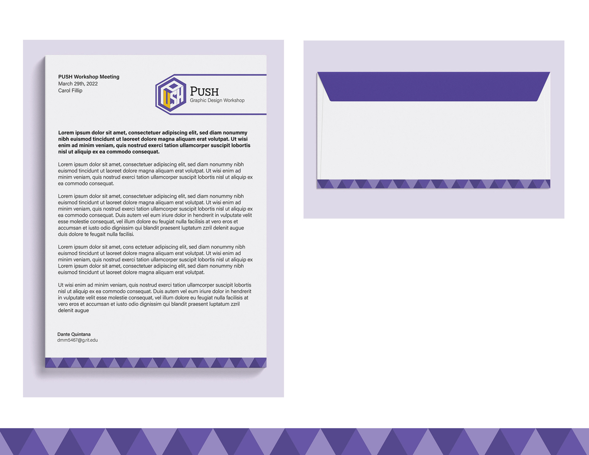
The final design consists of a geometric logotype within a box shaped silhouette. This honeycomb-like shape can be used as a part of the brand identity, alongside the triangles that make up the honeycomb.
The colors consist of a purple, similar to that of the RIT College of Art and Design brand, while the yellow is a custom accent color.
The title typeface, "Novecento Slab", was chosen for its geometric yet organic look. It creates an interesting contrast from the logotype while not distracting from the main logo too much.
The body typeface, "Acumin Variable Concept", was chosen due to its high legibility and friendly shape.
The secondary logos can be used for promotional materials such as posters, t-shirts, stickers, etc. While the one-color options are more tailored towards important documentation or official business items, as they require less money to print and are not meant for consumers.
I had quite a lot of fun designing this logo and design system! I hope to continue doing this kind of work in my future career as a graphic designer.