Climbing Cascade
Poster A
Poster A
Climbing Cascade
poster B
poster B

Overview
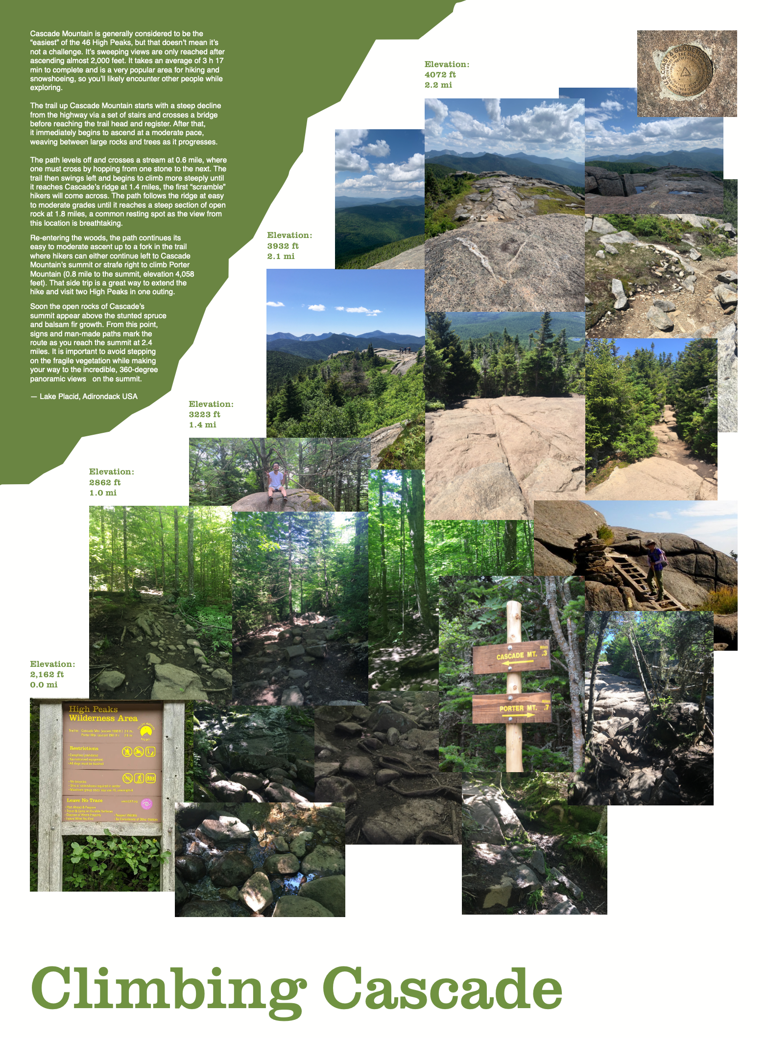
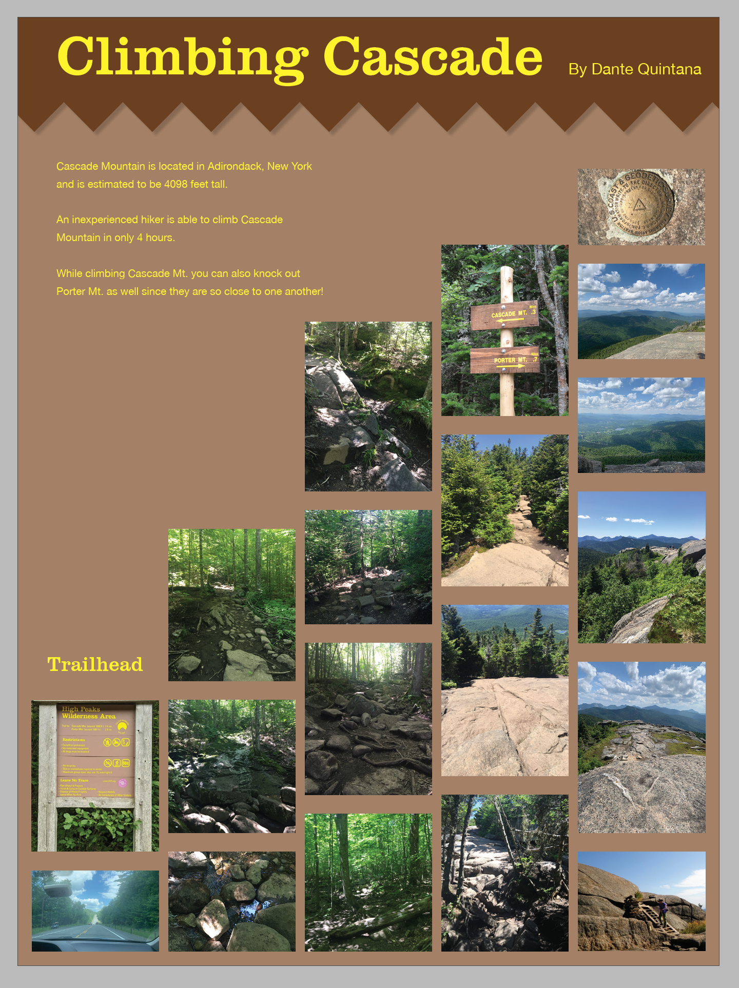
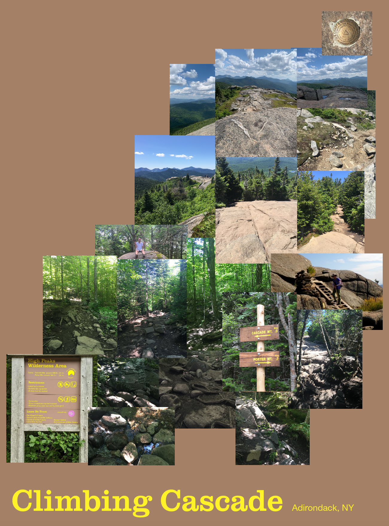
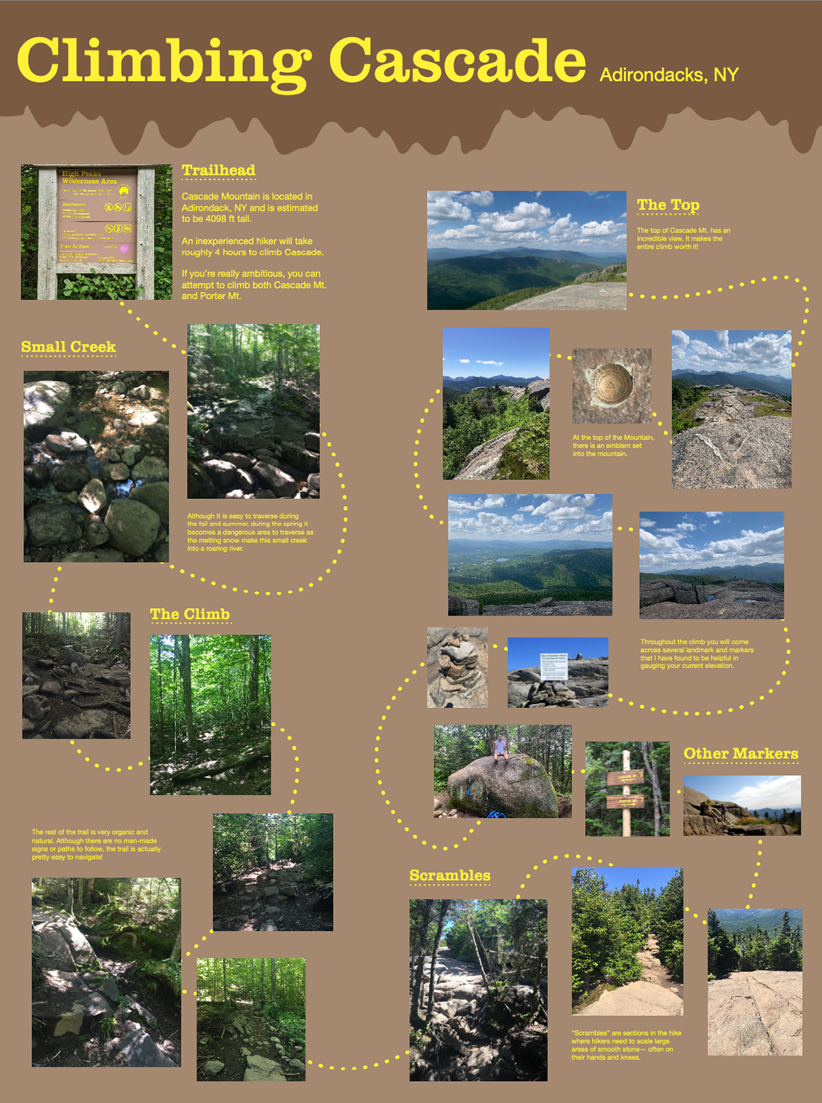
The Adirondack Mountains, located in Upstate New York, consist of 46 High Peaks. Cascade Mountain is the quickest mountain one can climb out of those 46 High Peaks.
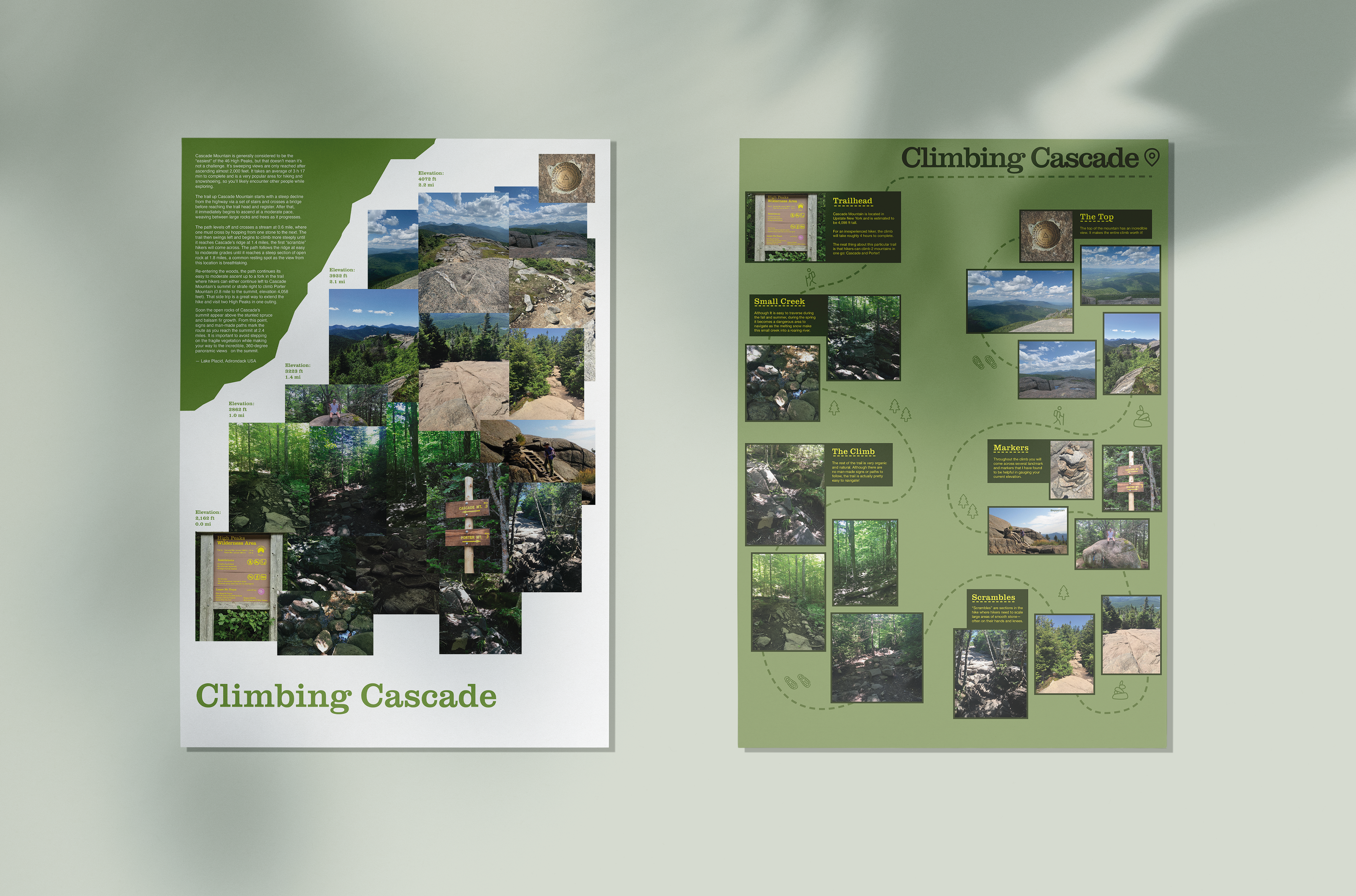
The two posters (18.5 x 25 in) consist of 20 or so images taken whilst I was climbing said mountain. The images depict what one will encounter if they, too, were to climb Cascade Mt. themselves, though the posters differ in the approach used to relay said information.
In the first poster, the images are arranged by the elevation at which they were taken whilst climbing the mountain path. They are also organized by the composition and colors within the photographs.
The second poster is arranged by land markers and their location on the trail. A squiggly dotted line is used to help lead the viewer's eyes around the poster in the correct sequence.
first concepts
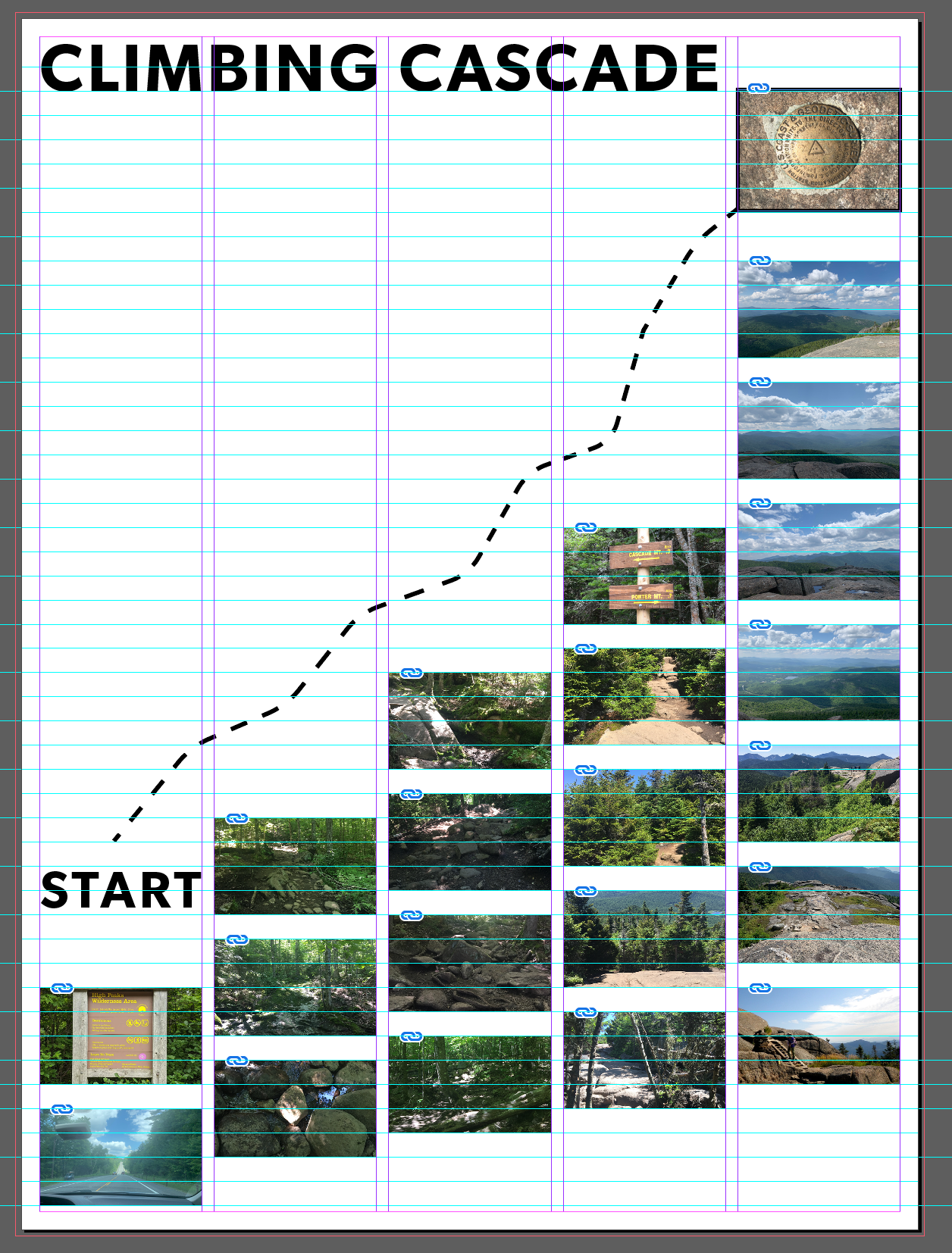
My first few design ideas followed a very strict grid, as I wanted to make sure all of the images were clearly visible and were able to communicate the information properly.
My initial idea was to stack the images in an increasing format to allude to the gain in altitude happening when climbing the Cascade Mountain path.
Unfortunately, the images did not read the way I wanted them to.
Due to the nature of the grid, I was attempting to make each image roughly the same size, despite some images being more visually interesting than others.
I decided to hide the grid until I had a more concrete design direction, as I was relying to heavily on the grid to design the poster for me. But fret not, I was planning on bringing the grid back once I had a better idea of how I was going to lay out the chosen images.
an aha! moment

Once I stopped worrying so much about the grid, I finally found my footing!
Although I normally love grids, I found it to be too restricting and was unintentionally holding me back.
This is the point in which I started to experiment with color and lines. The jagged lines of the "mountain range" was added to help separate the title text from the images, but ended up feeling more juvenile than I was intending.
I tile printed these poster designs as a way to better gauge what point size the typeface should be, as well as to see how well my images were reading at their current sizes.
The introduction of the dotted line in Poster B, although unintentionally, was actually quite helpful in helping me organize the design with the inclusion of the grid once again.
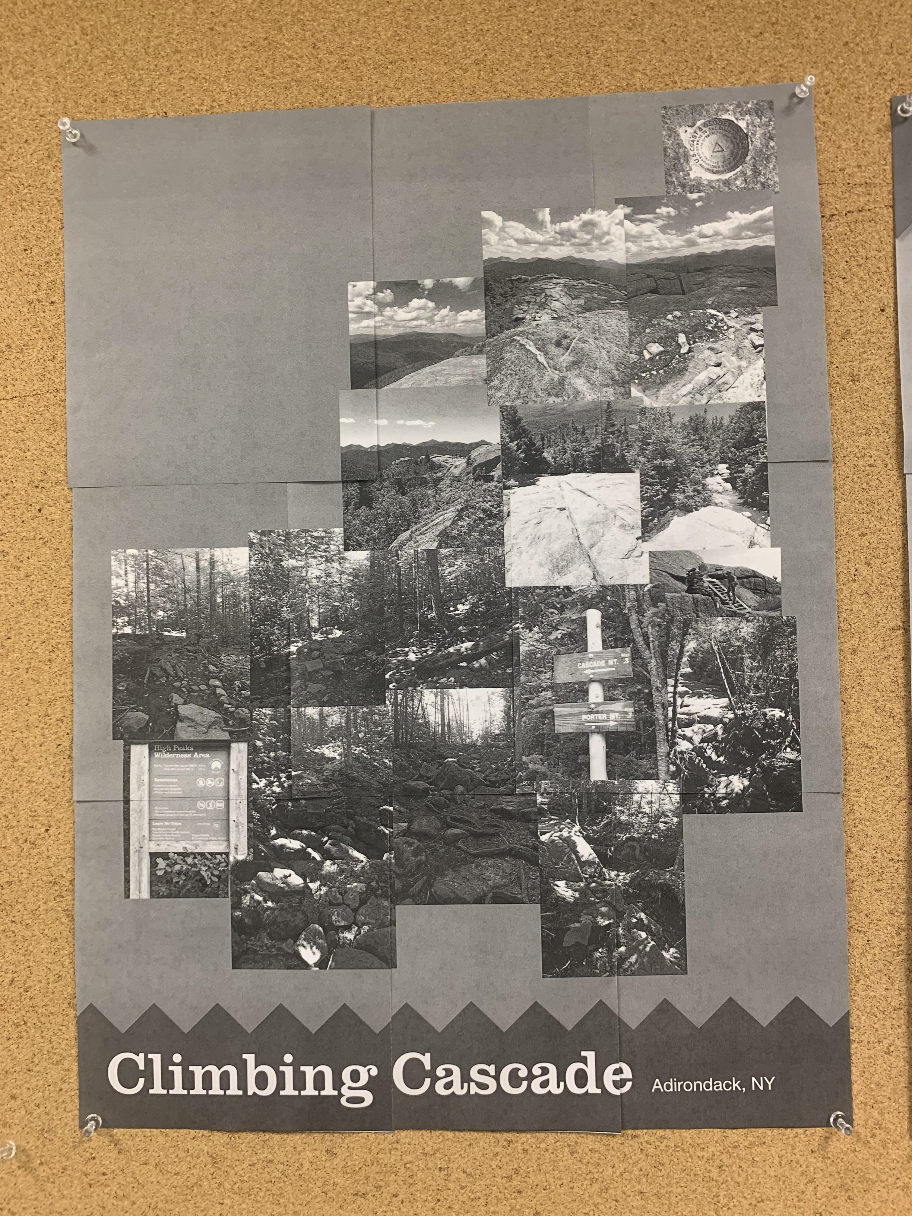
Final Product


The final printed versions of these two posters are something else.
I had never printed anything larger than 11x17 in. at this time, so these 18x25 in. posters felt gigantic to me!
These two posters ended up cost me a pretty penny as I accidentally chose to print them on an expensive paper at the print lab. I learned quite a valuable lesson that day in knowing your printing paper.